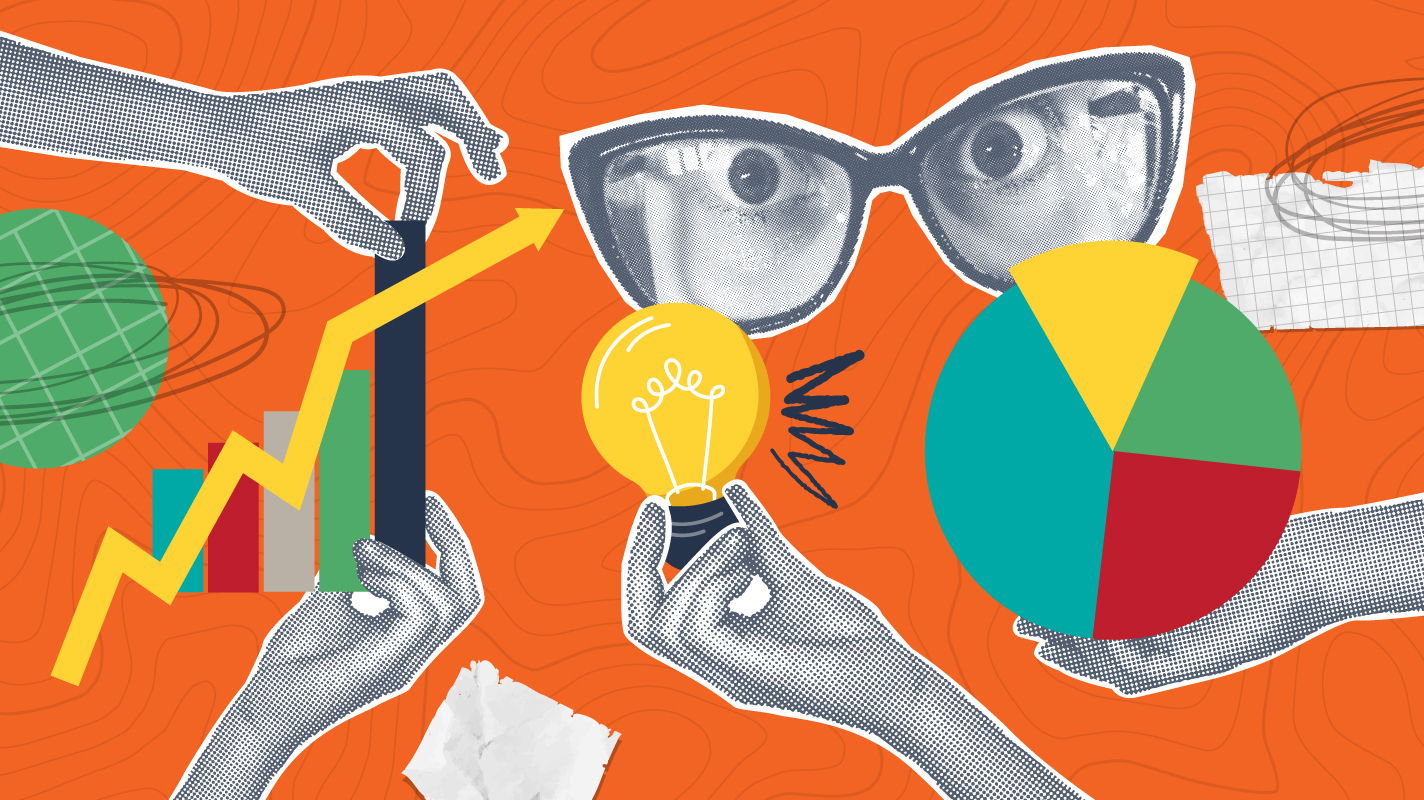
Whenever I hear the word data, I picture spreadsheets full of numbers and information, and then I immediately get a headache. Data visualizations and infographics help transform raw data into a more easily understood format, allowing complex information to be displayed and disseminated in a consumable and succinct format.
What is Data Visualization?
Wikipedia says, “Data visualization is the practice of designing and creating graphic or visual representations of a large amount of complex quantitative and qualitative data and information using static, dynamic, or interactive visual items.”
IBM says, “Data visualization is the representation of data through the use of common graphics, such as charts, plots, infographics, and even animations. These visual displays of information communicate complex data relationships and data-driven insights in a way that is easy to understand.”
Those are good definitions, as they refer to the visual representation of complex data or information and are media/format agnostic. Other related terms you may have heard of are information design and infographics, which are each types of data visualization.
The Origins and Evolution of Data Visualization
Earlier in my design career, I was fortunate to attend a workshop led by Edward Tufte, a pioneer in data visualization. His 1983 work, The Visual Display of Quantitative Information, remains a hallmark of information design thinking and writing.
Tufte describes Charles Joseph Minard’s 1869 graphic of Napoleonic France’s invasion of Russia as what “may well be the best statistical graphic ever drawn”, noting that it captures six variables in two dimensions. Indeed, it’s an awe-inspiring example of data visualization, made even more impressive considering its age and handmade creation.
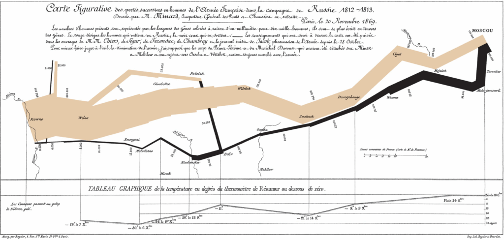
The most prominent element is the thick band depicting the dramatically shrinking troop numbers during the advance (tan) and retreat (black) from the Polish-Russian border to Moscow, but the brilliance of Minard’s graphic is how it simultaneously depicts five other types of data: the number of troops, the distance traveled, temperature, latitude and longitude, direction of travel, and location relative to specific dates. It’s a map and chart all in one.
Although the modern study of visualization began with the advent of computer graphics, data visualization isn’t a modern development. Cave paintings depicting the position of the stars and constellations, such as those in Lascaux Cave in France, may well be considered early infographics.

The invention and production of paper and parchment allowed maps and other data visualizations to be more easily created and transported, while advances in techniques and tools for precise measurement and the development of analytical geometry and a two-dimensional coordinate system allowed for ever more accurate and scientific data visualization.
Advantages of Data Visualization in Marketing
Studies have shown that individuals used, on average, 19% fewer cognitive resources and were 4.5% better able to recall details when comparing data visualization with text.
I don’t know about you, but I think understanding and remembering more quickly and easily are compelling reasons to present data visually within marketing materials. We all want our content and messaging to be impactful and easy to understand, and with the sheer volume of information our audience consumes on a daily basis, anything that makes key data points more memorable is a win-win.
In our work at Seventh Scout, we’re always striving to cut through the noise and present our audience with relevant and digestible information and messaging. Data visualizations and infographics are a great way to call out important details and present them in engaging and scannable formats.
There’s (Almost) Always an Agenda
Mark Twain famously popularized the saying, “There are three kinds of lies: lies, damned lies, and statistics.” He referred to his own difficulty understanding figures and to the idea that statistics can have persuasive power, even when used inappropriately.
I’ve always loved that quote, because it speaks to the reality that data, in and of itself, lacks a clear narrative or focus and can easily be misinterpreted or misunderstood.
Enter data storytelling. Data storytelling is the concept of building a compelling narrative based on complex data and analytics that help tell your story and influence and inform a particular audience. Without a coherent data story guiding the interpretation, your audience is left with a collection of figures and visuals without meaning.
I’m certainly not suggesting that you use data visualization to mislead your audience or misrepresent the data being presented, but rather offering a reminder to consider the goal and objective of your communications and to create data visualizations that align with your objectives and move your audience toward the intended goal.
Examples of Data Visualization and Infographics in Our Work
Maybe it is rocket science: These charts and infographics from a New Meridian white paper emphasize the importance of STEM education as well as the challenges state education departments face implementing Next Generation Science Standards (NGSS)-aligned science assessments.
D[ata]iversity, Equity, and Inclusion: Established by the City of Austin, the Elevate Grant provides an ongoing budget for arts organizations, individual artists, and creative businesses that produce culturally vibrant and diverse artistic content. Seventh Scout created these dashboards using data from the City of Austin Economic Development Department to showcase the demographics of the applicants and recipients from the 2023 Elevate Grant.
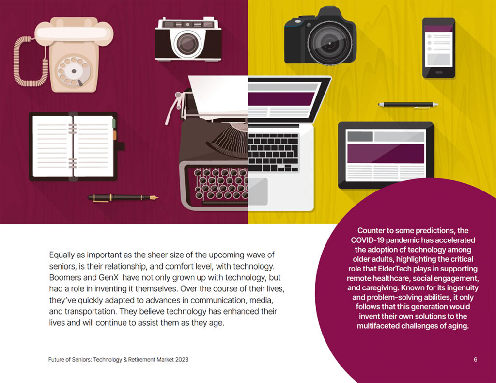
Show and tell: The above infographic is from a market report about the role and impact of technology in the lives of current and future senior citizens. By visually conveying the evolution and changes within communication technology that have taken place during the lives of Boomers and GenX, the graphic supports the accompanying text that describes their comfort with—and adoption of—emerging technologies. While it doesn’t contain any numbers or data, the graphic provides an understandable and hopefully memorable depiction of technology adoption.
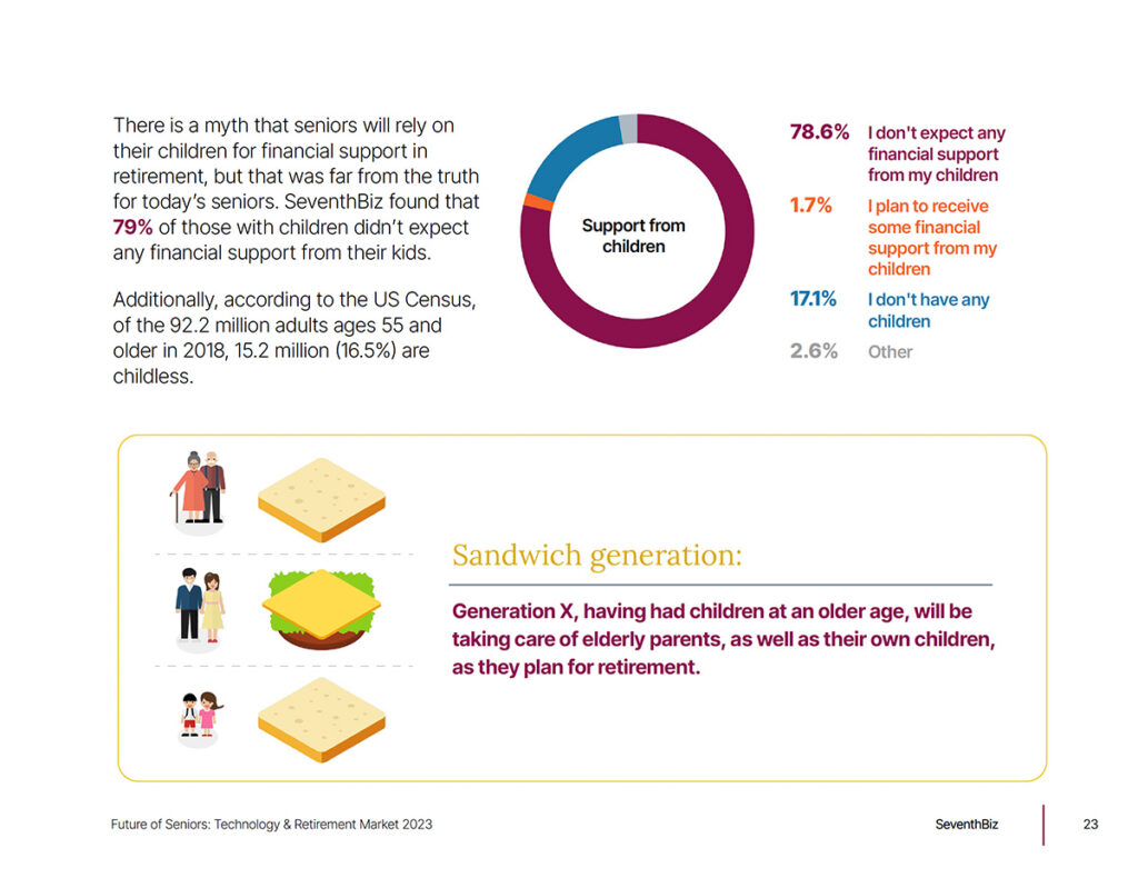
Hold the mayo: A page from the same report has a simple pie/donut chart showing that the overwhelming majority of seniors don’t expect to receive financial support from their (adult) children. The chart is accompanied by a graphical representation of the “sandwich generation” demographic, underscoring the responsibilities impacting GenXers with young children and aging parents.
Conclusion
As you can see (pun intended), data visualization and infographics have the potential to make complex information more accessible and easier to understand for your audience.
How can you leverage data storytelling to make your content and materials more impactful?