
The Mississippi Behavioral Health Learning Network (MSBHLN) was established by the Mississippi Public Health Institute (MSPHI) in partnership with the Mississippi Department of Mental Health, Bureau of Behavioral Health Services/Addictive Services, to provide workforce development opportunities for behavioral health providers in Mississippi.
MSBHLN plays a critical role in supporting behavioral health professionals across Mississippi, providing training and continuing education opportunities that directly impact care in communities. But as the program grew, so did the complexity of communicating their brand and its offerings clearly.
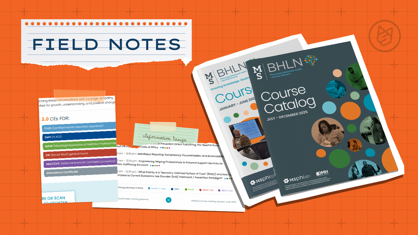
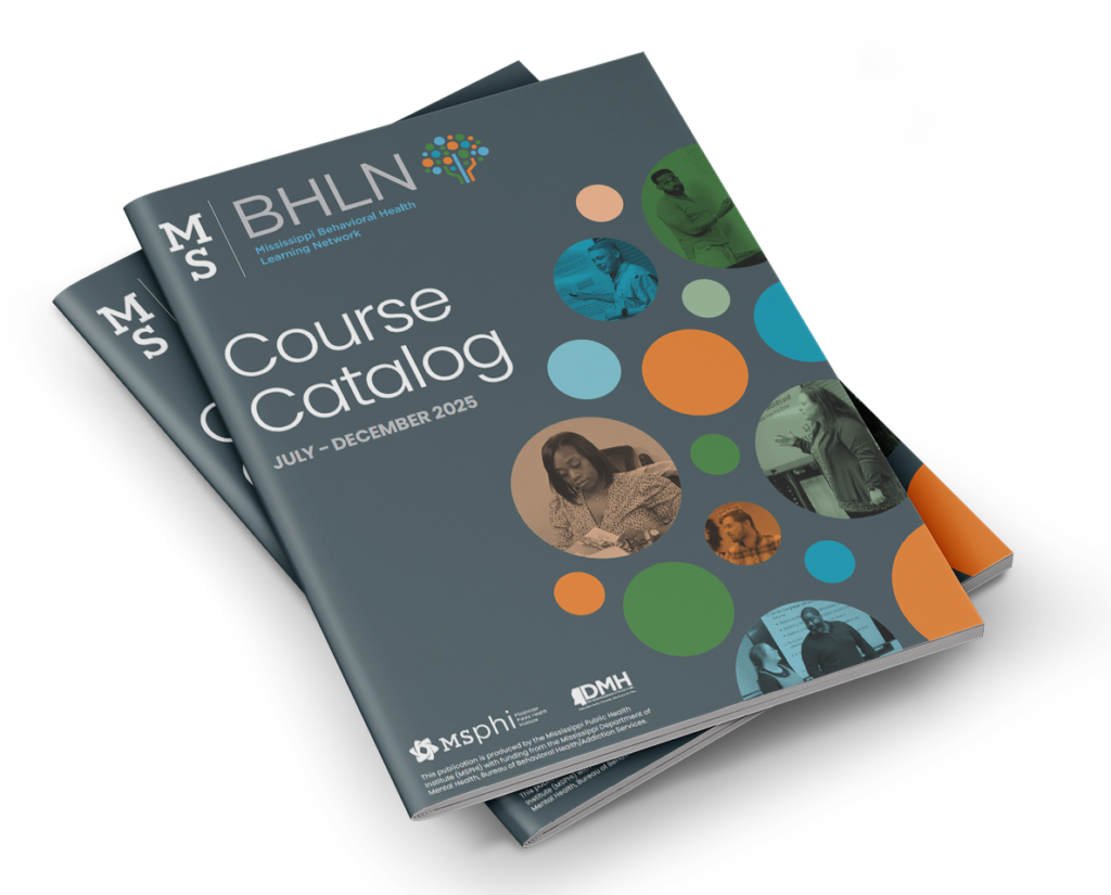
In early 2025, Seventh Scout began working with the team at the Mississippi Public Health Institute on a new logo and brand identity for the Mississippi Behavioral Health Learning Network. Each year, MSBHLN publishes two course catalogs outlining a robust list of available trainings, and upon completion of the brand identity, we applied its new look and feel to the design and layout of the July-December 2025 Course Catalog.
"We are so thankful for the fantastic work on the course catalog! It looks professional, polished, and visually engaging, which is exactly what we hoped for. Seventh Scout’s creativity and attention to detail really shine through, and we’re grateful for the effort they put into making this such a strong sample of the great work we do! What’s made the biggest difference, though, is how clear and easy the catalog is to navigate. Our trainees have fewer questions, which means our team can spend more time focused on the work itself."
Jordon Hillhouse, Workforce Development Manager
Putting Information Design First
We began our work on the Course Catalog design and layout by reviewing several years’ worth of old catalogs. Besides the year-to-year inconsistencies in branding and design, one of the first things we noticed was that the page design often made the content difficult to consume. Unnecessary imagery and textures competed with the important information about the training courses. Stylistic choices, such as heavy black borders or fake digital tablet frames, might be fine in limited use, but over the course of a 60+ page document, they cause visual fatigue for the reader.
Our approach to designing the MSBHLN Course Catalog was informed by information design. Its core principles include knowing the audience, organizing content with logical hierarchy, ensuring consistency, maximizing accessibility, and using clear, simple visuals. Our primary goal is to minimize cognitive load while maximizing user engagement and comprehension.
Knowing the Audience
Through stakeholder conversations, we learned that MSBHLN’s primary users are licensed behavioral health professionals who often need to complete continuing education (CE) requirements.
So we asked: How can we make it easier for them to identify the trainings that matter most?
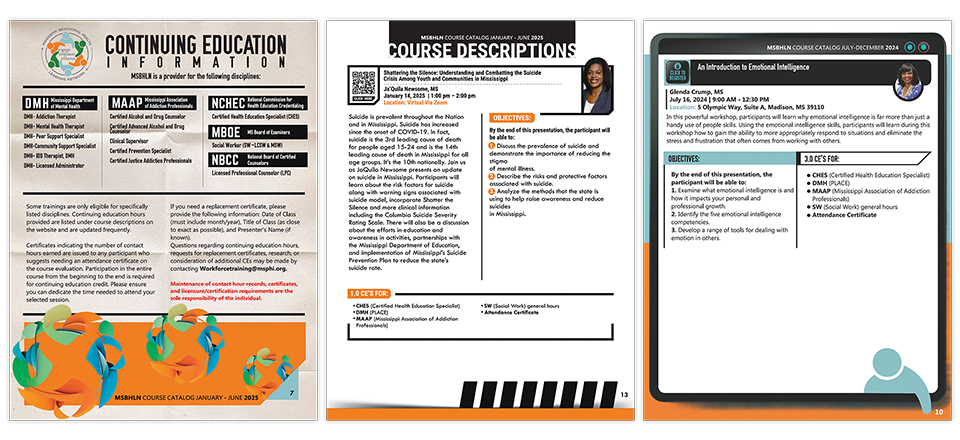
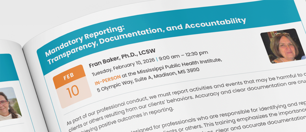
Previous years’ catalogs segmented and listed the disciplines and occupations related to CEs, but we chose to introduce color coding to the CEs, knowing it would help the audience identify which courses were relevant to them. This color coding was introduced near the beginning of the catalog and was then applied to the Schedule at a Glance and Course Description pages.
Content Hierarchy and Organization
Next, we rethought how information flows on each page. A clear hierarchy of information was a major goal of our design approach. Though consistent and distinct heading sizes, we aimed to make the catalog’s content as easy to digest as possible. We considered the audience’s actions when planning the content organization on each page. Whereas some of the old course catalogs located the course registration link/QR code at the top of the page near the course title, we purposely moved this element to the bottom of the page, with the understanding that taking action to register for a training occurs after the reader is familiar with the content, objectives, and CE information for that course. This aligns the design with how people actually make decisions.
Encouraging course registration is the overarching, primary purpose of the catalog, and while placing the means to do so in the top-left corner of the page might seem like a good hierarchical location for the detail, we found it made it easy for the audience to miss or overlook this critical call to action.
Consistency and Accessibility
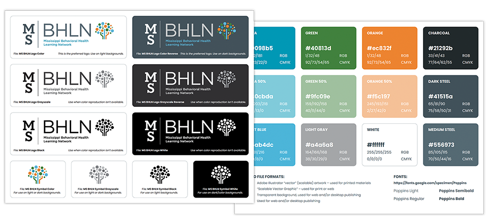
To support the wide range of course offerings, we developed a flexible page structure that could accommodate varying content lengths, multiple presenters, and both virtual and in-person formats. At the same time, consistency remained a priority. The repeated use of MSBHLN brand colors, typography, and layout patterns created a cohesive experience across the entire catalog.
Accessibility and readability guided every decision. We wanted each course description page to feel clean, intuitive, and easy to understand, ensuring that design elements supported the content rather than distracting from it.
Visual Clarity and Simplicity
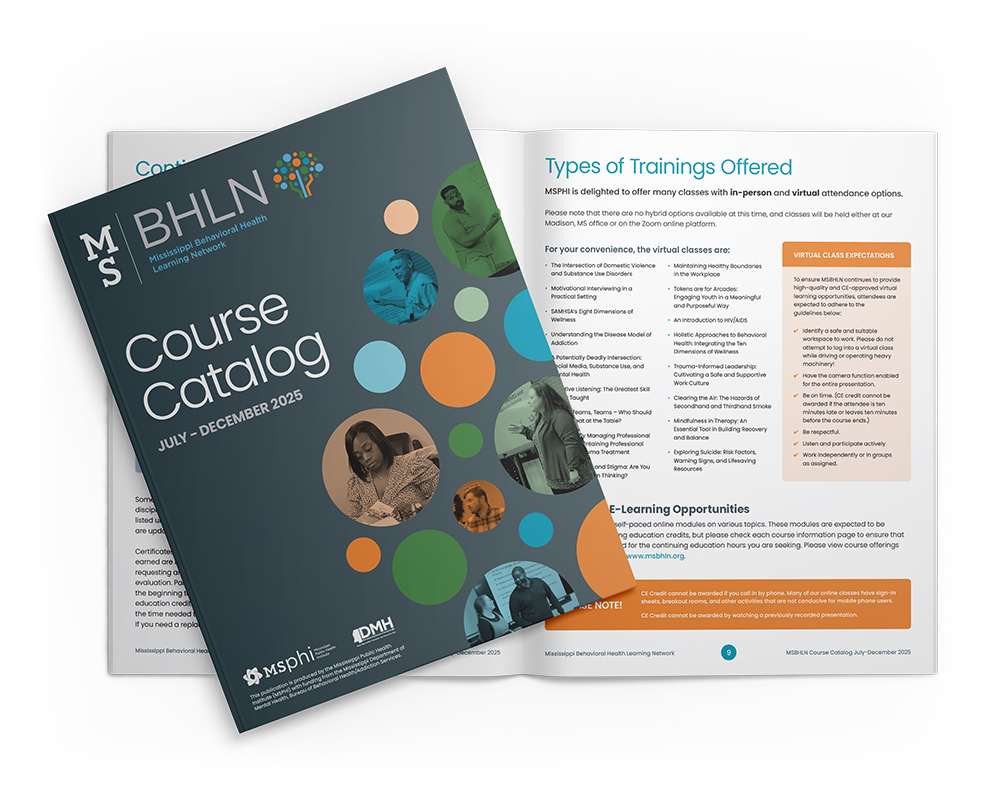
The catalog’s design aesthetics were directly inspired by the MSBHLN brand identity. Rounded corner containers, thin borders and dividers, and circular graphic elements related back to the details of the MSBHLN logo. This visual harmony strengthened and reinforced the new brand identity.
It was important to us to use design details and elements intentionally. For example, we applied a calendar page design treatment to the dates on each course description page, knowing this familiar visual cue would help their target audience quickly and easily identify when each training was scheduled. These small but purposeful details helped improve usability while reinforcing the overall design system.
“What stood out most about this project was the impact it has beyond the page. By making the catalog clearer and easier to navigate, we’re helping behavioral health professionals spend less time searching and more time learning and serving their communities. That’s the kind of work that feels especially rewarding.”
Christine Bartkowski, Seventh Scout
The Next Catalog
A Blueprint for Future Designs
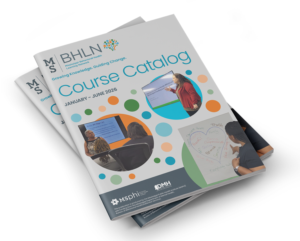
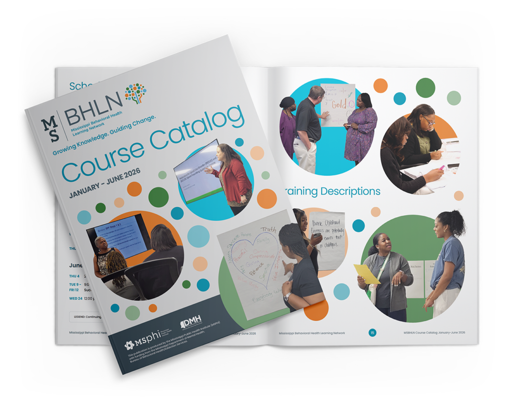
When it came time to design the January-June 2026 Course Catalog, the success of the initial redesign allowed us to build upon an already strong foundation. This if-it-ain’t-broke outcome allowed us to turn our focus to the catalog cover and section title pages. The cover for the January-June 2026 catalog would look familiar to anyone who’d seen the July-December 2025 catalog, but a light gray instead of a dark gray background would easily differentiate the two.
The folks at MSPHI had provided us with a wealth of photos taken at in-person training sessions at their headquarters in Madison, MS, and while we loved the authentic nature of the images, their candid, informal context led to a lot of visual clutter in the backgrounds. By isolating the people from the environments, we were able to champion the presenters and participating behavioral health providers. Adding brand-color circular background shapes reinforced the MSBHLN brand identity, while having people intentionally extend beyond the circular backgrounds reinforced the energy and passion of the instructors and students.
When Design Works, Everything Works Better
This project is a great example of what happens when design decisions are rooted in real user needs. By simplifying structure, reducing visual noise, and focusing on how the audience interacts with the content, the MSBHLN Course Catalog evolved into something more than a document—it became a tool that works. And when it works, it makes a meaningful difference for both the people using it and the team supporting it.