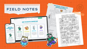


For a long time, our website reflected exactly who we were. Then, little by little, it didn’t. There wasn’t a single moment when we realized it. No dramatic meeting. No terrible analytics report. No existential crisis.
The truth is much simpler.
Seventh Scout is more than ten years old. Over that time, our team has changed. Our clients have changed. The marketing landscape has changed. And somewhere along the way, the stories we told about ourselves stopped evolving at the same pace.
Our branding wasn’t broken and our website wasn’t failing us. In fact, both had served us remarkably well. But they no longer felt like an honest reflection of who we are today.
So we decided it was time for a refresh.
Not because we wanted to chase trends or reinvent ourselves. Quite the opposite. We wanted our brand and website to better express what has always mattered to us: being thoughtful partners, doing meaningful work, and creating marketing that helps organizations grow.
This is the story of why we made that change, and what the process taught us along the way.
Finding a Clearer Voice
As we evaluated our website, we noticed something we see all the time when working with clients.
We were making people work too hard to understand who we are.
Our previous website spent a lot of time explaining our process: how we think, how we work, and the steps we take with clients. Those things matter, and we’re proud of the systems we’ve developed over the years, but process isn’t the reason people hire an agency.
People hire an agency because they want to grow. They want clarity. They want a partner they trust to help them solve difficult problems.
Somewhere along the way, we realized we were burying the most important part of our story. Not because we lacked confidence in our work, but because we were so focused on explaining how we do things that we weren’t spending enough time communicating the impact we make.
The goal of our new website was to communicate more clearly.
To say what we do. To show who we are. And to make it easier for people to decide whether Seventh Scout is the right partner for them.
Clear Over Clever
One of the biggest changes we made had very little to do with design. It was about language.
As marketers, it’s surprisingly easy to overcomplicate the way we talk about ourselves. Over the years, our website had accumulated a lot of language about process: how we work, how we think, and the frameworks we use with clients.
Those things matter. Our approach is intentional, and the relationships we build with clients are shaped by years of experience.
But as we stepped back and looked at the site with fresh eyes, we realized something: We were making people work too hard to understand who we are.
Our messaging spent a lot of time explaining ourselves and not enough time explaining what our clients gain by working with us.
So we adopted a simple principle: Clear over clever.
That meant writing in plain language. It meant saying exactly what we do and who we help. It meant focusing less on marketing jargon and more on outcomes.
- We’re easy to work with.
- We know what we’re doing.
- We have deep experience.
- And most importantly, we help organizations communicate more effectively and grow.
That doesn’t mean our process stopped mattering. In fact, our approach is one of the things we’re most proud of.
We believe in listening carefully to our clients, learning from their expertise, and bringing our own experience to the table. We believe great marketing is collaborative. We believe trust is earned over time.
But we realized something important: Clients don’t hire us because they want to learn our process.
They hire us because they want the results that process creates.
More clarity. More confidence. More meaningful connections with their audiences. The way we work matters because of where it leads.
The Cobbler’s Children Need Some Fresh Kicks
Knowing What Not to Change
For a project about change, one of the first decisions we made was not to change very much.
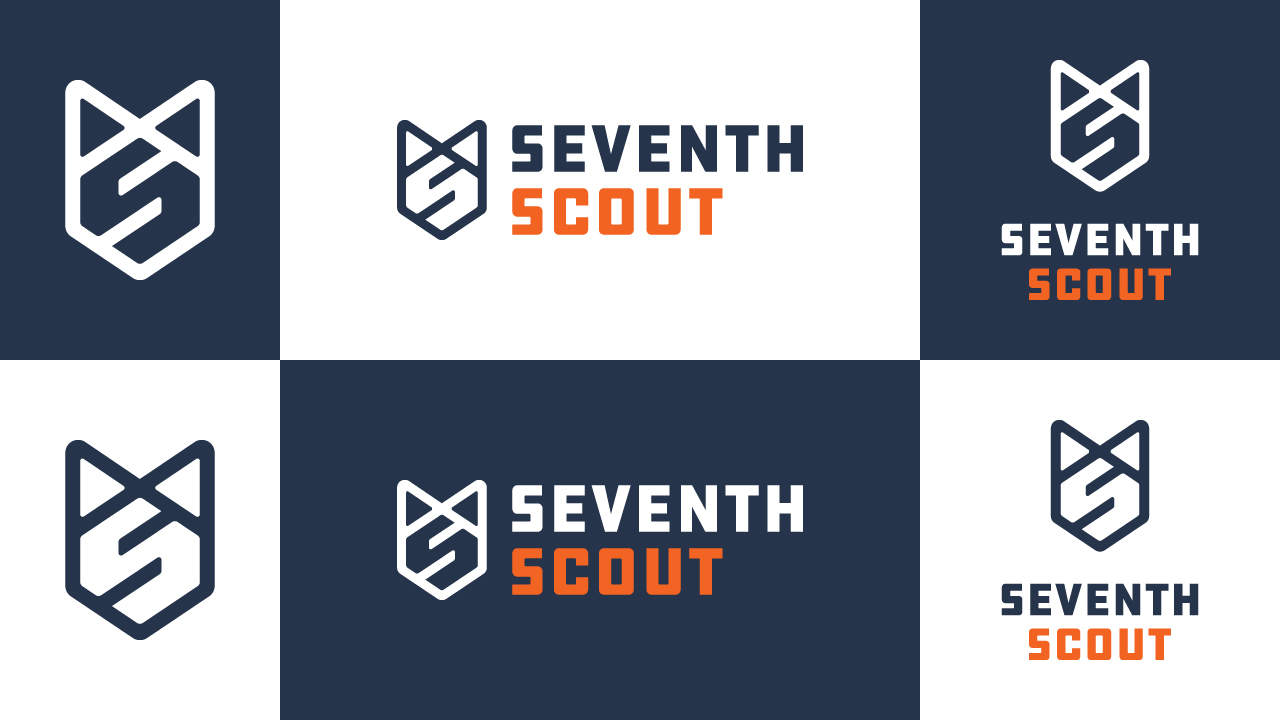
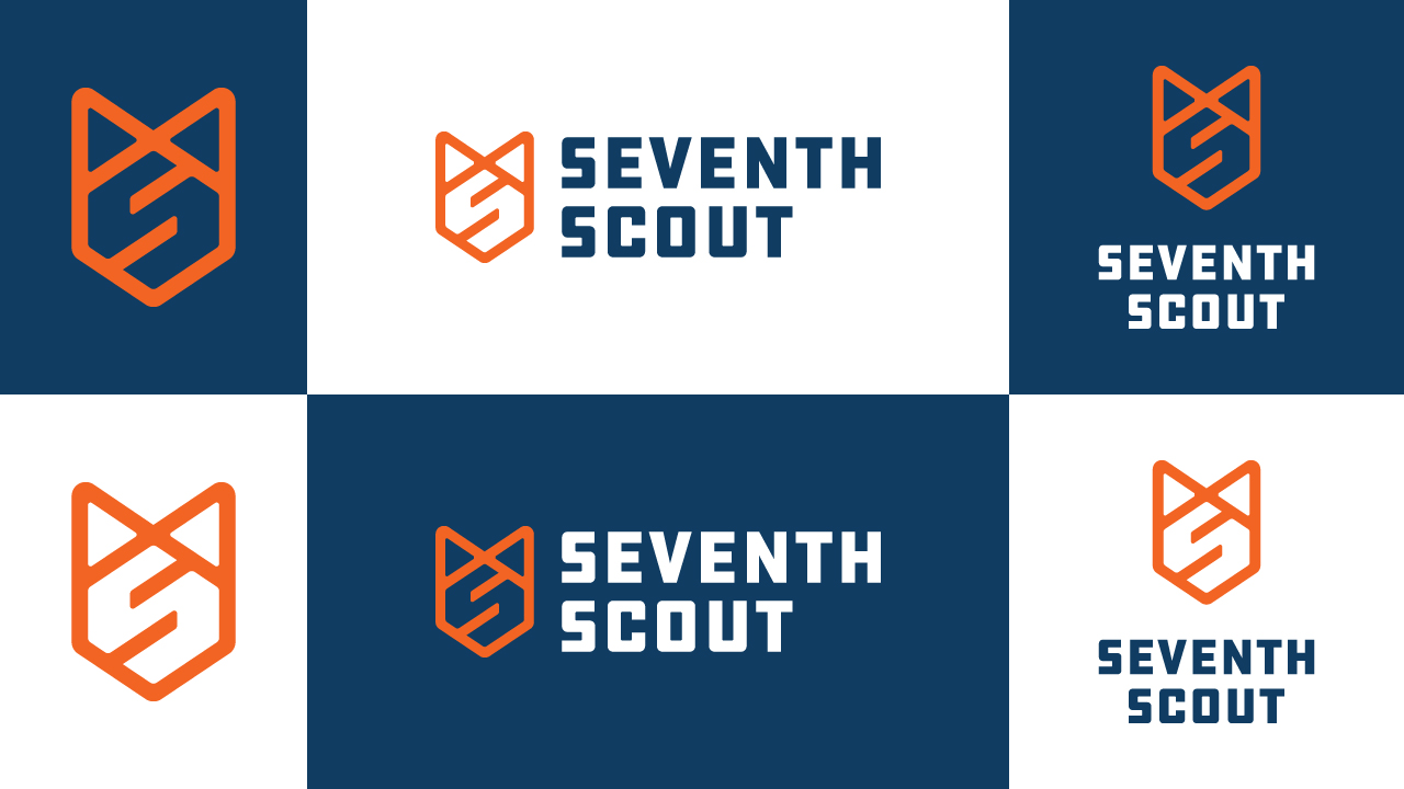
Our logo has represented Seventh Scout for more than a decade. It carries history and recognition that we weren’t interested in discarding. So we kept it.
The updates we made were subtle but intentional. We simplified the color treatment by pairing our Scout Orange logo mark with a single-color wordmark, either (a slightly brighter) dark blue or white, depending on the application.
Before
After
These small changes gave our logo mark a stronger association with our most recognizable brand color while making the agency name easier to read and remember.
More importantly, they reminded us that not every brand refresh needs to start from scratch.
Sometimes the strongest design choice is recognizing what already works and giving it room to shine.
Professional, Fun, and a Little Bit Loud
Our color palette changed more dramatically.
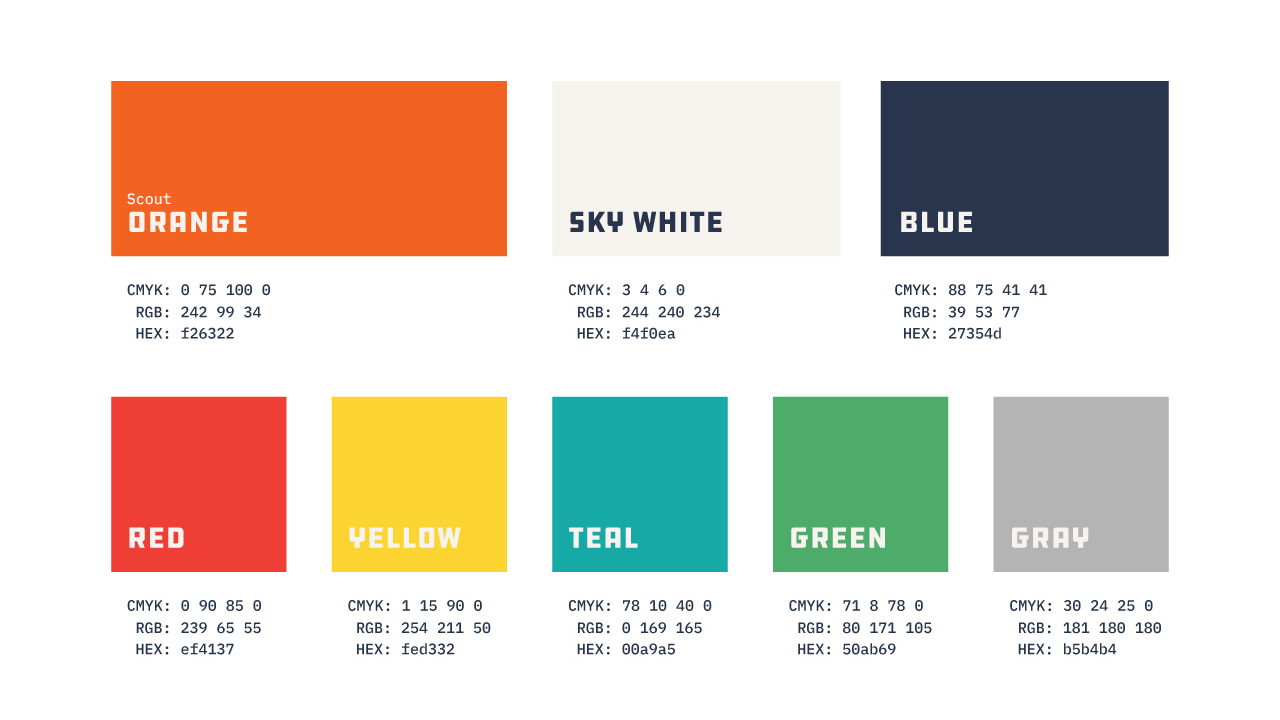
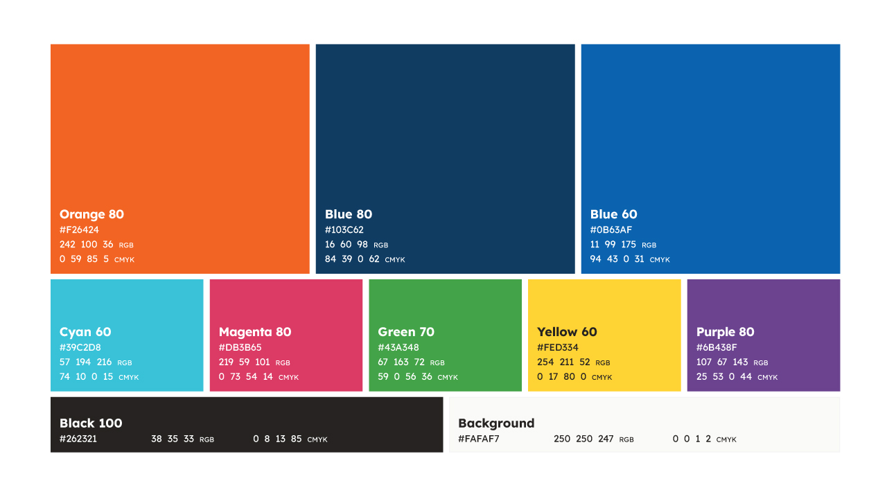
Scout Orange stayed exactly the same. Some things are sacred. Everything around it, though, was reimagined.
We wanted colors that felt energetic without being loud. Professional without feeling corporate. Distinct as individuals, but stronger together.
Before
After
Our blues became brighter and more saturated. New hues joined the family. And rather than defining a handful of colors, we built a full system with shades and tones that give us flexibility across digital and print applications.
Along the way, one particular shade kept rising to the top: Blue 60.
It felt approachable and confident. Professional but fun. Which, if we’re being honest, is exactly how we’d like people to describe us.
And yes, if the whole palette feels a little rainbow-adjacent, that’s not entirely accidental. We like color. We like joy. And we think brands are allowed to have personalities (and should).

None of Us Are Good Corporate Fits
Typography ended up being one of the most meaningful parts of the refresh. Not because fonts are magical. Okay, maybe a little because fonts are magical. But mostly because typography has a voice. And over time, we realized the voice of our brand had changed.
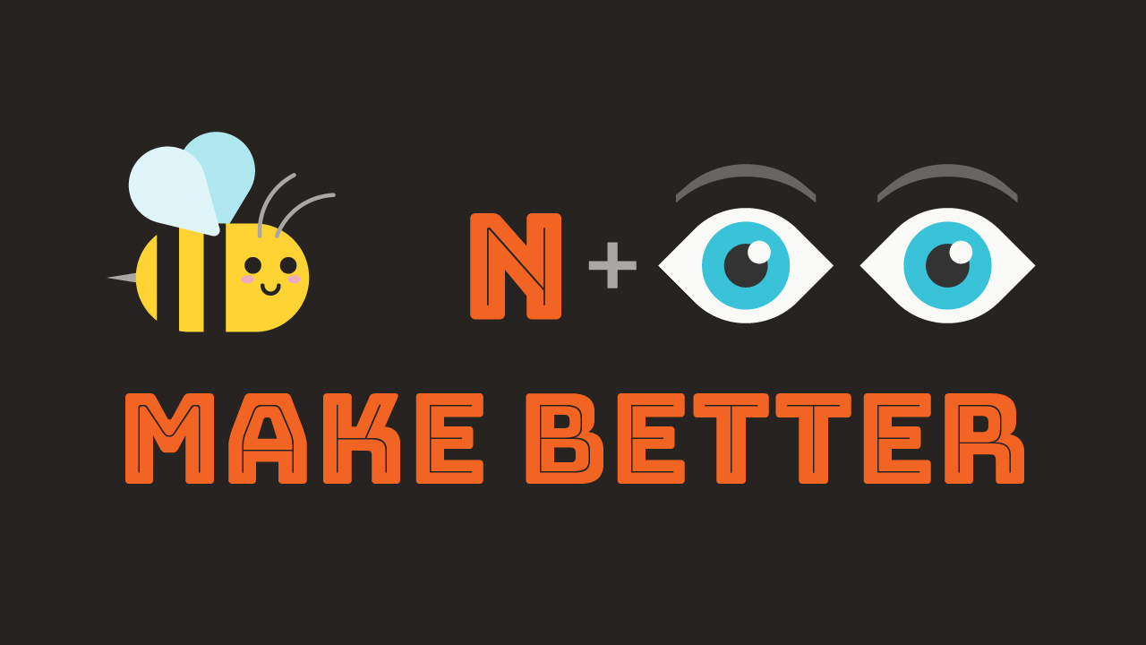
Our previous type system centered around DDC Hardware, the same typeface used in our logo. We still love it. It’s bold, utilitarian, a little retro, and full of personality.
But when used throughout the brand, it started to feel too monolithic. The typography echoed the logo so closely that both lost some of their distinctiveness. More importantly, it no longer felt like the way we speak.
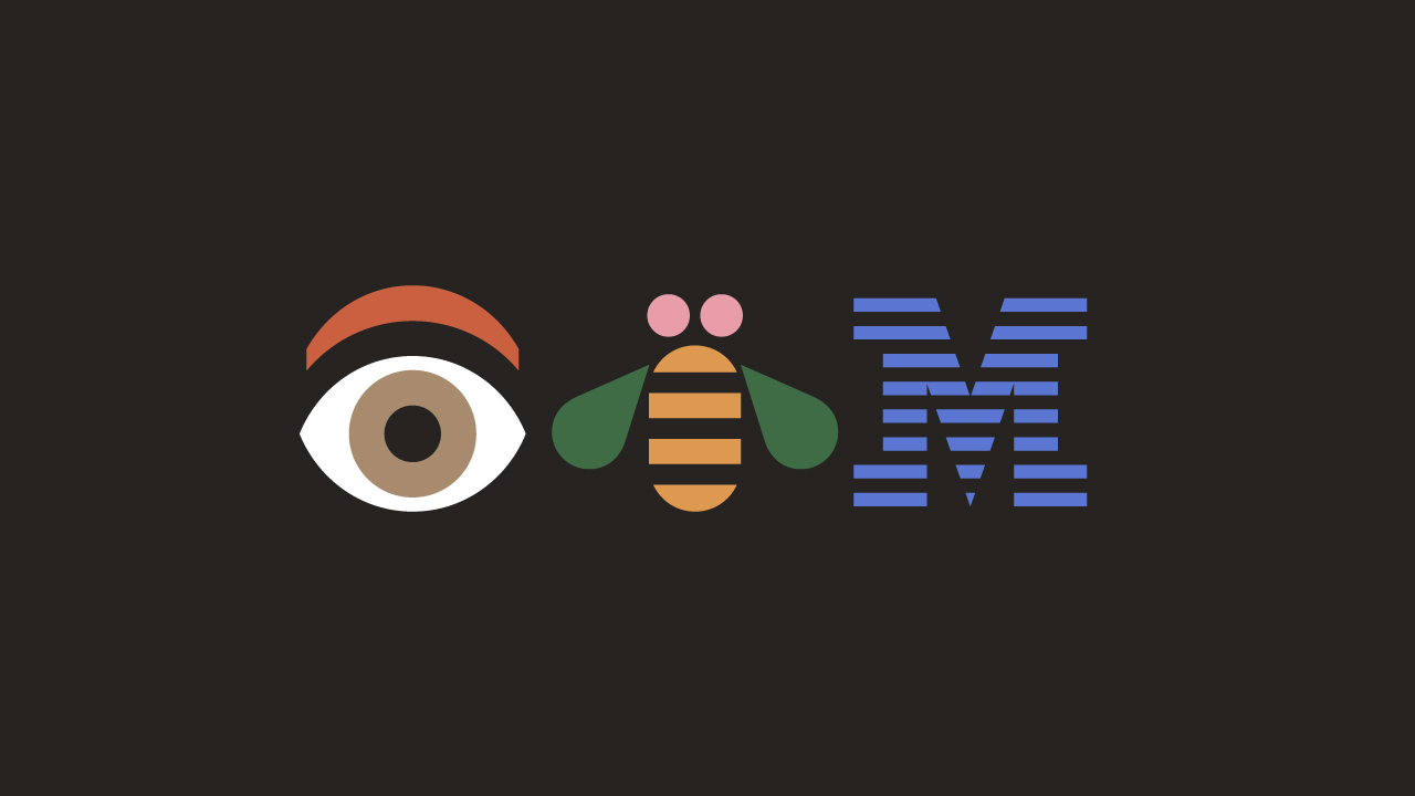
The other typefaces in our legacy brand guidelines were IBM Plex Sans and IBM Plex Serif. IBM will always have a soft spot in this designer’s heart thanks to the inventive work of legendary graphic designer Paul Rand (IYKYK, and if you don’t, you should). The IBM Plex font family is beautiful, distinctive, and thoughtfully crafted. But as much as I admire IBM’s design legacy, we’re certainly not IBM.
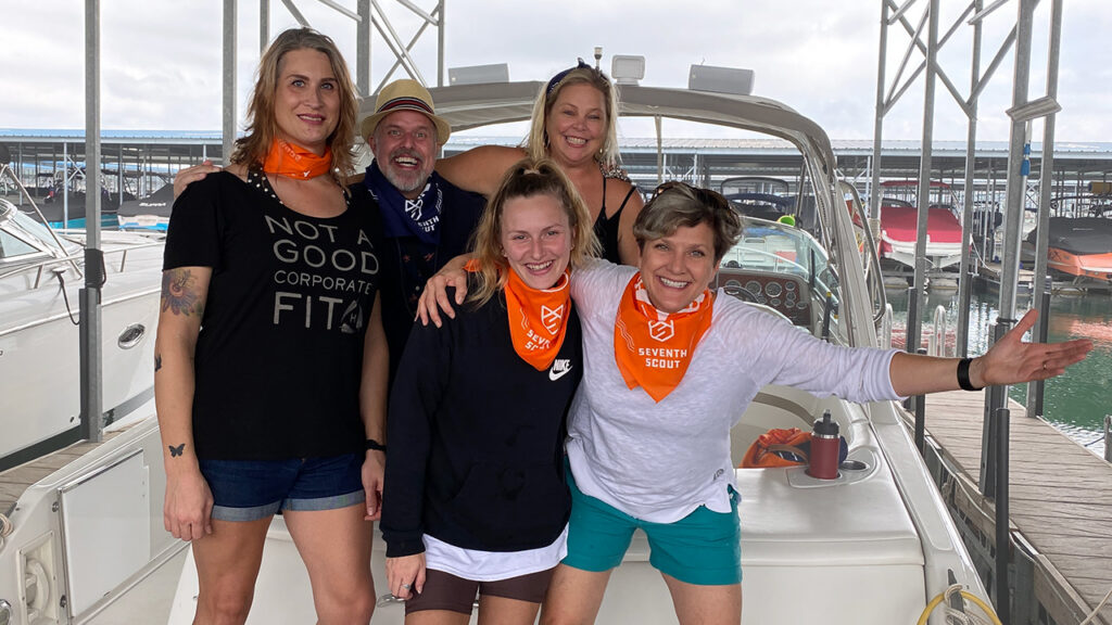
I’m reminded of an old photo of our team. I’m wearing a T-shirt that says, “Not a Good Corporate Fit.” That shirt says it all. It turns out, none of us are good corporate fits, and that’s a feature, not a bug.
We’re thoughtful and professional, but we’re also approachable. We take our work seriously without taking ourselves too seriously. We value expertise, but we don’t hide behind jargon or corporate polish.
Our typography needed to reflect that.
So we built a new typographic system around Lexend, a typeface designed for readability and accessibility that somehow manages to feel both modern and approachable.
We paired it with Source Serif 4, whose warmth and expressive italics bring a bit of humanity and flexibility to the system.
And when we need something louder, stranger, or more playful, we turn to Bungee—a display typeface that reminds us not to take ourselves too seriously.

Together, these typefaces feel a lot like Seventh Scout itself: Thoughtful. Capable. A little quirky. And much more interested in being authentic than being corporate.
Typography nerd footnote: I have an unreasonable affection for type design, and choosing these fonts was one of my favorite parts of the project. If Aaron Draplin, Paul Rand, or open-source typography are your thing, too, we should probably be friends.
Will this refresh make us a better agency? We hope not. Because the goal was never to become someone different. The goal was to better reflect who we already are. To communicate more clearly. To show more personality. To make it easier for the right people to understand what we believe, how we work, and whether we’re the kind of partners they’d want by their side.
We think a lot of organizations find themselves in a similar place. Maybe your business has grown. Maybe your team has changed. Maybe your website still tells a story that was true five years ago, but doesn’t quite fit anymore. That doesn’t necessarily mean you need a complete rebrand or a shiny new website. But it might mean it’s time to ask some important questions.
Does your marketing reflect who you are today?
Does it communicate clearly with the people you’re trying to reach?
Does it feel like you?
Those aren’t always easy questions to answer. But we’ve learned something from this process: The most meaningful marketing work rarely starts with colors, fonts, or wireframes.
It starts with listening. It starts with honesty. And it starts with having the courage to tell your story as it is today—not as it was, and not as you think it should be.
If that sounds like the kind of conversation you’d like to have, we’d love to talk.