The Hill Country Ride for AIDS (HCRA) is one of our favorite local organizations. A critical mission, talented and passionate people, and beautiful Texas Hill Country scenery are a winning combination in our books, and we’ve been fortunate enough to lend our branding and design services to the ride for the past several years. From 2022’s “The Reunion,” a celebration of returning to a full in-person Ride Day (after two years of COVID-era virtual riding experiences), to 2024’s “Silver Summit,” which marked the twenty-fifth annual ride, creating brand materials that align with an annual theme is our favorite part of this partnership.
A few months ago, our Seventh Scout team hosted a brainstorming session with the Hill Country Ride for AIDS team and members of the HCRA board to discuss the theme and direction for the 2025 ride. The HCRA team brought us the general theme for the upcoming event: The Wizard of Oz. A theme with so much history and so many pop culture aspects was a bit daunting. There were so many directions we could explore!
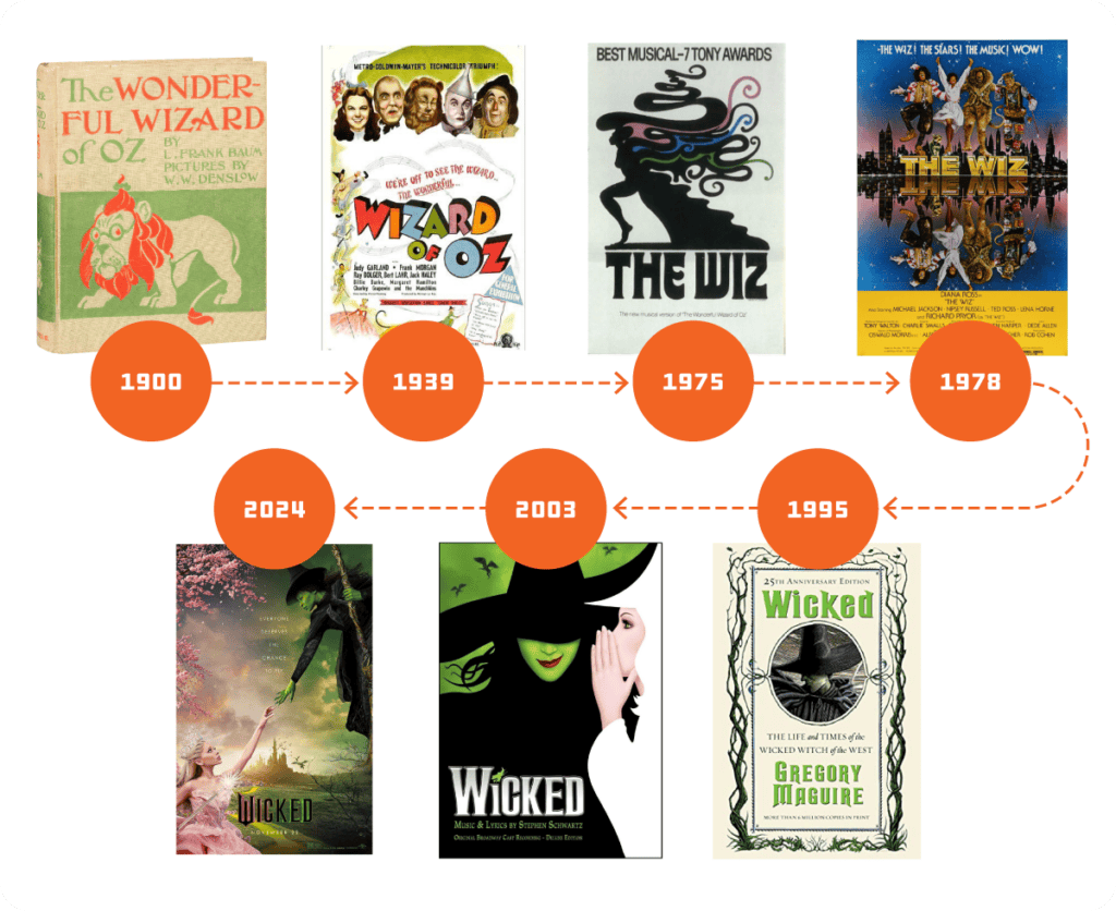
During this lively discussion, we decided on “Ease On Down the Road” as the theme for the 2025 Ride. The theme’s namesake was originally a song composed by Charlie Smalls for the Broadway musical The Wiz. The song was immortalized in Diana Ross and Michael Jackson’s duet as the theme song of the 1978 film version of The Wiz, reaching #17 on the Billboard Hot Soul Singles chart. We loved the idea of centering the theme on the disco-era sweet spot of The Wiz, and the very notion of “easing” down the road was perfect for HCRA, which always calls itself “a ride, not a race.”
Getting Started
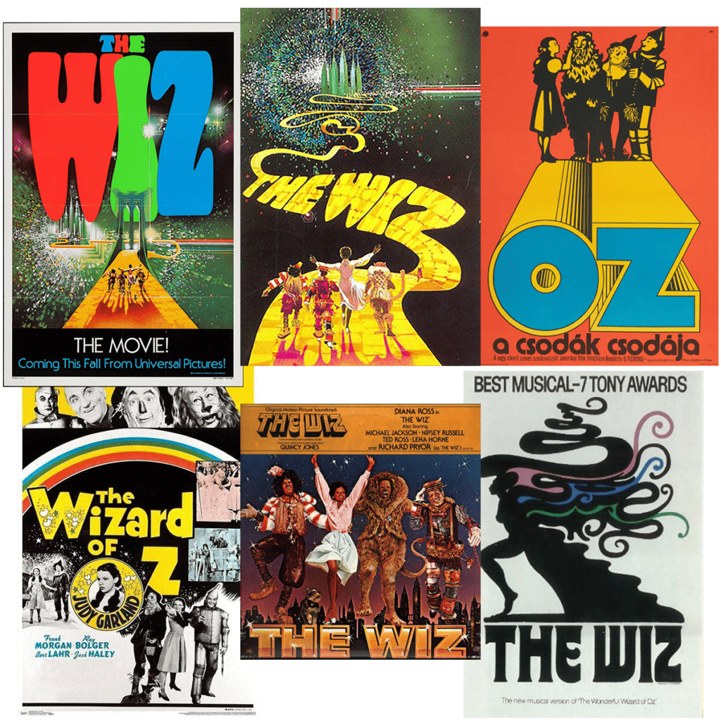
The HCRA team and our Scouts quickly got started on mood boards and visual inspiration for the look and feel of the thematic branding for the 2025 Ride.
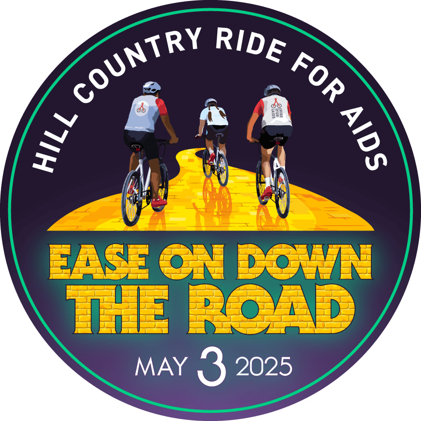
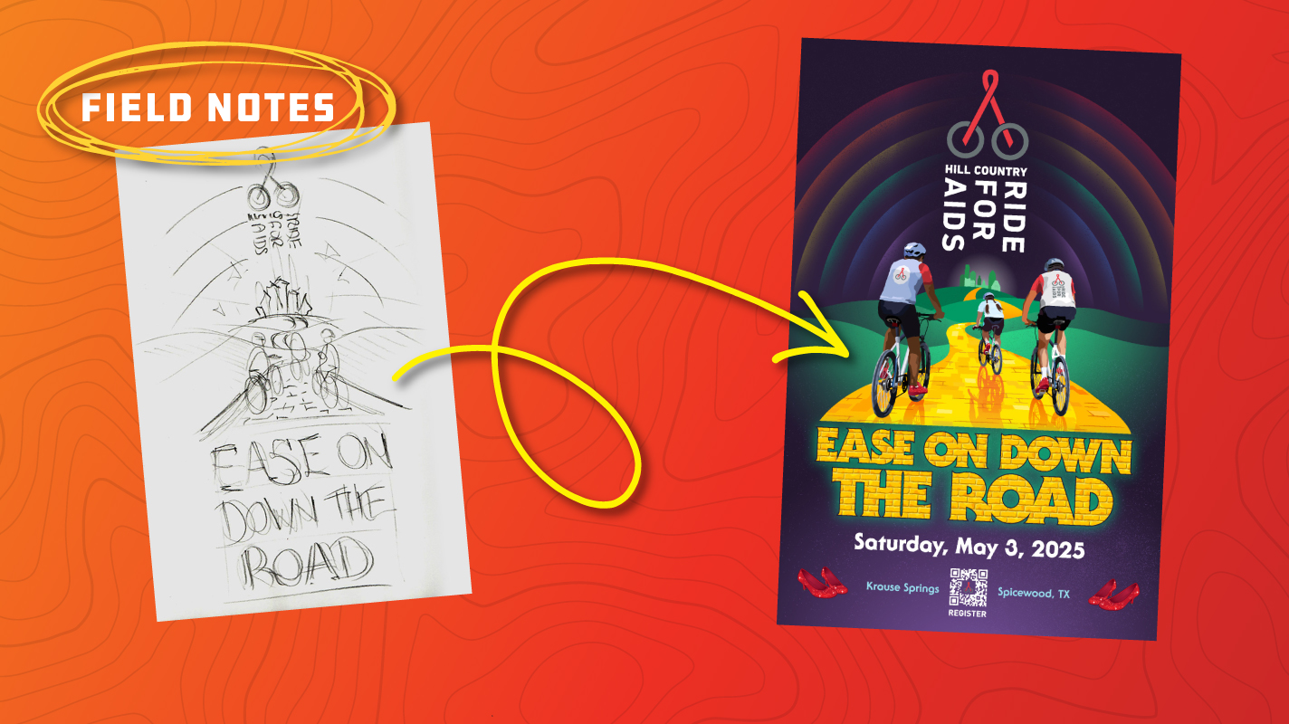
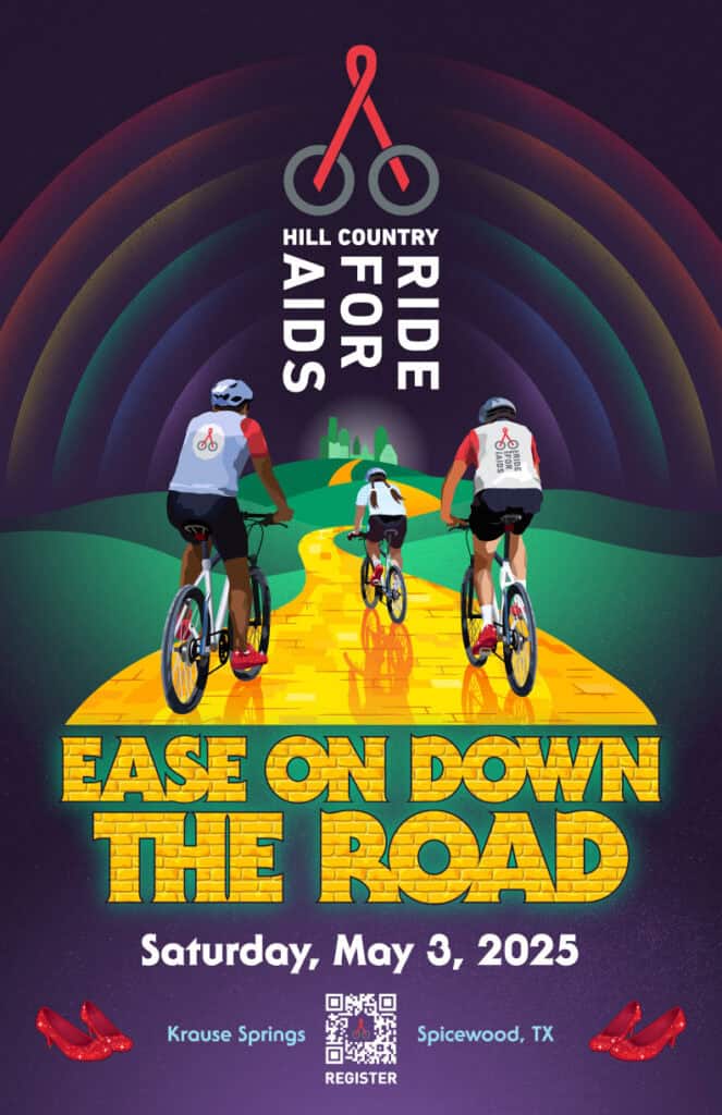
The promotional poster for the event is the centerpiece of each year’s branding. The poster’s design influences everything from social media graphics to the style of the rider jerseys. My concept for the poster was a group of riders on a yellow brick road heading through the hills toward the emerald city. I wanted the Hill Country Ride for AIDS logo to appear prominently on the poster and the “Ease On Down the Road” text to be bold and attention-getting.
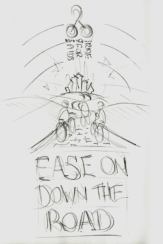
With a rough sketch in place, my next steps would be to design the “Ease On Down the Road” title and work on the stylistic treatments of the other visual elements of the poster: the riders, the yellow brick road, and the emerald city.
Fun With Fonts
As a big-time lettering and typography geek, I was eager to start designing the event name. It’s no surprise that I’m also fascinated by the design of movie posters and title sequences, so I began by looking at the opening title sequence of the film version of The Wiz for inspiration. The dimensional shadow treatment and gold gradient effect of the bold sans serif lettering used on the title card and actor names in the title sequence were interesting. Still, it seemed too similar to the shiny metallic lettering style used in last year’s “Silver Summit” theme branding, and it lacked consistency and personality.
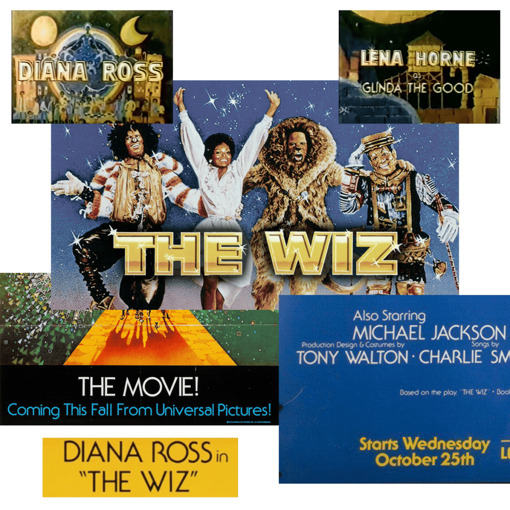
A closer look at the movie posters and title sequence revealed the purposeful use of ITC Serif Gothic, a hybrid serif/gothic typeface designed by Herb Lubalin and Tony DeSpigna in 1972. Its design is loosely based on one of my favorite typefaces, Lubalin’s geometric sans-serif Avant Garde, but with subtle serifs added.
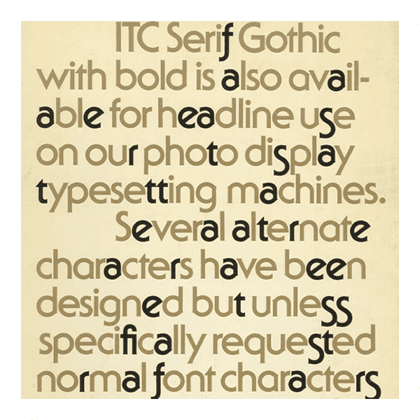
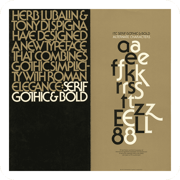
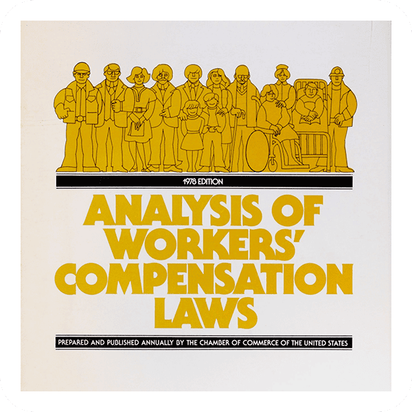
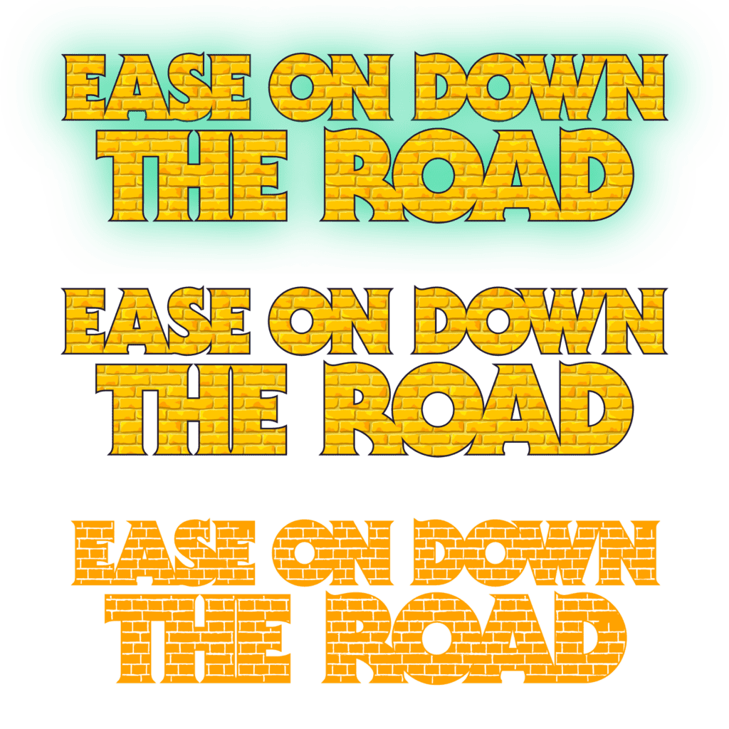
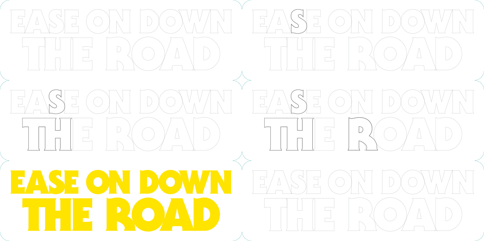
I envisioned the “Ease On Down the Road” title as a bold, yellow brick pattern-filled element on the poster and began to explore treatments for it using the Black weight of ITC Serif Gothic.
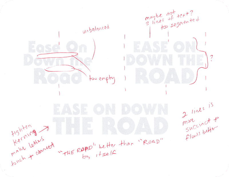
Once the basics of the title treatment were established (all caps, two lines of text with “THE ROAD” larger), I paid close attention to the kerning (letter spacing) of the characters. This included modifying the T and H in THE to form a custom ligature and adjusting the S and R for a better fit within the title.
Putting It All Together
I then explored illustration styles for the yellow brick road and the riders on the poster, sourcing royalty-free vector images from iStock.
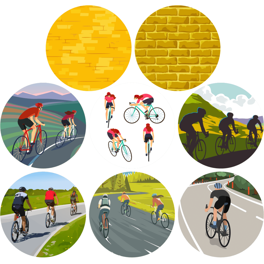
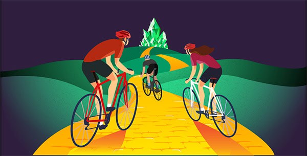
The almost photorealistic illustration of the three riders shown at the lower left above was graphic without appearing cartoon-y, and the angles and perspective of the riders fit perfectly within the poster layout. I also liked that the realistic appearance of this illustration would allow me to dress the riders in HCRA jerseys from previous years’ rides!
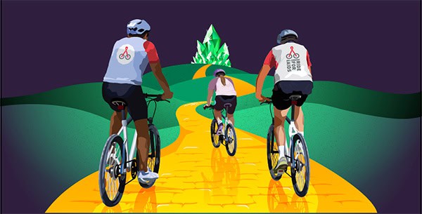
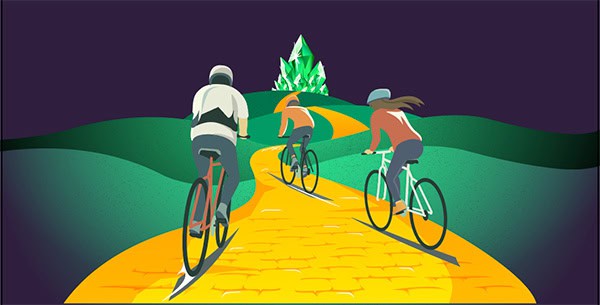
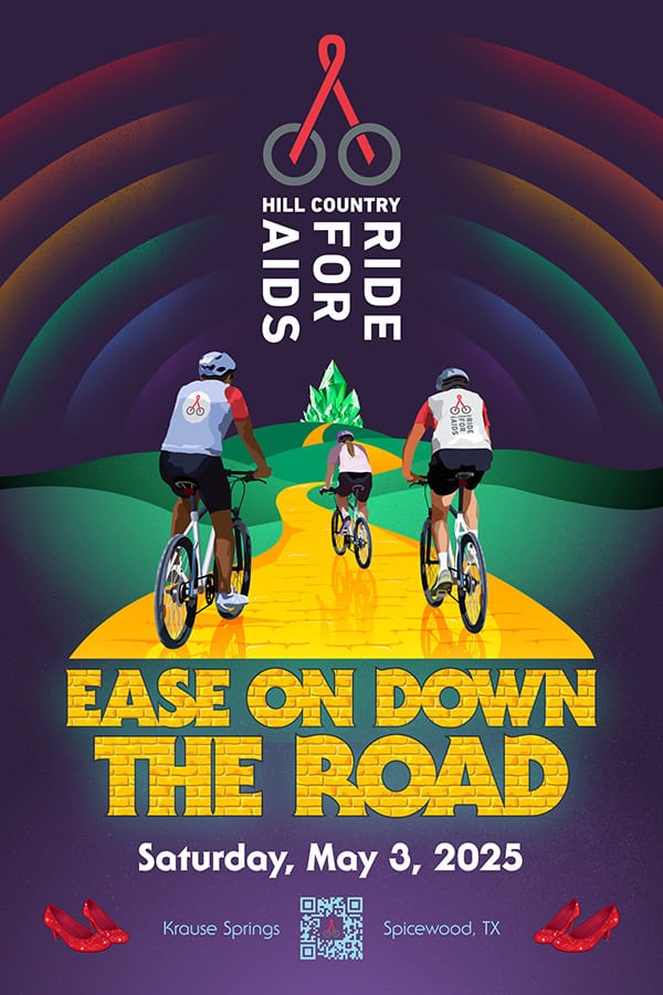
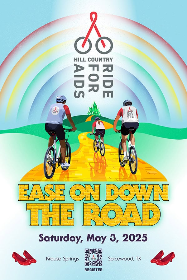
Variations were explored as the poster’s design progressed. You’ll notice differences in the amount of detail shown on the yellow brick road as well as the size and shape of the rainbow treatment in the sky. Perhaps the most significant variation was night versus day. Although a daytime scene might be more literal (the ride begins early in the morning in the springtime), using a dark background for the poster created a more dramatic effect and provided greater contrast for the elements of the poster.
After Further Review
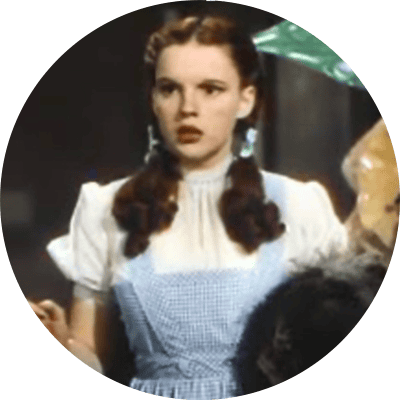
I presented a first draft of the poster to the HCRA and Seventh Scout teams. While all were pleased with the overall design and appearance, they also had several excellent suggestions that ultimately improved the design. The jewel graphics depicting the emerald city were replaced with the Austin skyline, the riders’ shoes were updated to ruby slippers, and best of all, the rider with the ponytail got pigtails and a light blue gingham makeover!
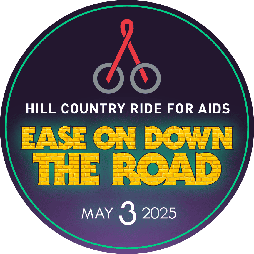
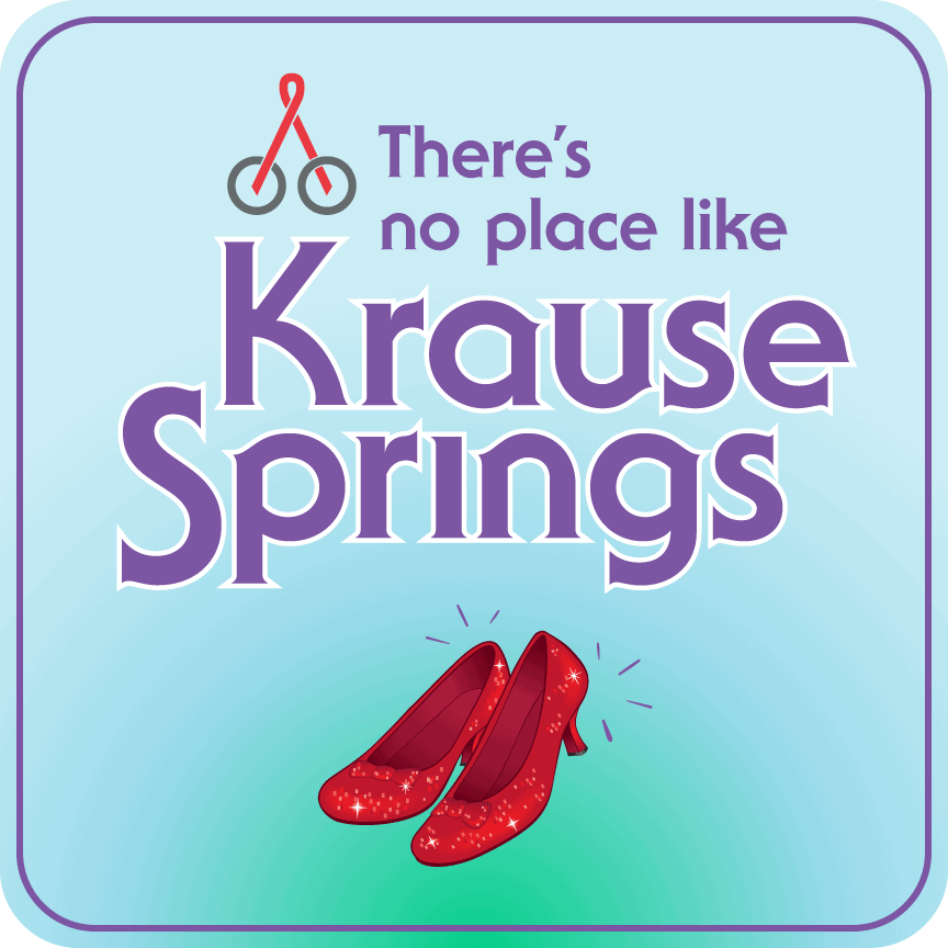
Once the poster design was finalized, we provided the Hill Country Ride for AIDS team with additional “Ease On Down the Road” branded identity elements and some fun graphics that riff on the Wizard of Oz theme.
