Today we’re going to talk about brand identity guidelines – what they are, how they’re created, who uses them, and why they’re important. First things first, let’s review the various names and terms that companies, marketing agencies, and graphic designers use for these guidelines. You may hear them called Brand Guidelines, Brand Style Guides, Brand Identity Guidelines, Identity Guidelines, Visual Identity Guidelines, or Corporate Identity Guidelines.
Despite the many names they’re known by, their purpose is generally the same: They are a documentation of the visual aspects of a company or organization’s “look-and-feel,” and they provide specifications, guidelines, and instructions for maintaining visual consistency and cohesion across a variety of materials and media types.
What are Brand Identity Guidelines?
A brand’s look and feel – its visual identity – is comprised of several elements, which often include:
Let’s take a closer look at these elements, why they’re important, and how they work together to create a company’s brand.
Logo Usage Guidelines
A company or organization’s logo is the very heart and soul of its brand. It should be the single most recognizable element of a visual identity. The logo guidelines outlined in a brand style guide should provide an overview of the various element’s configurations of the logo, as well as how and when to use each configuration.
Defining the “clear space” for the logo – that is, the minimal amount of space between the logo and other elements – is also an important aspect to define. A logo loses its visual presence and impact when crowded by the other elements in a design.
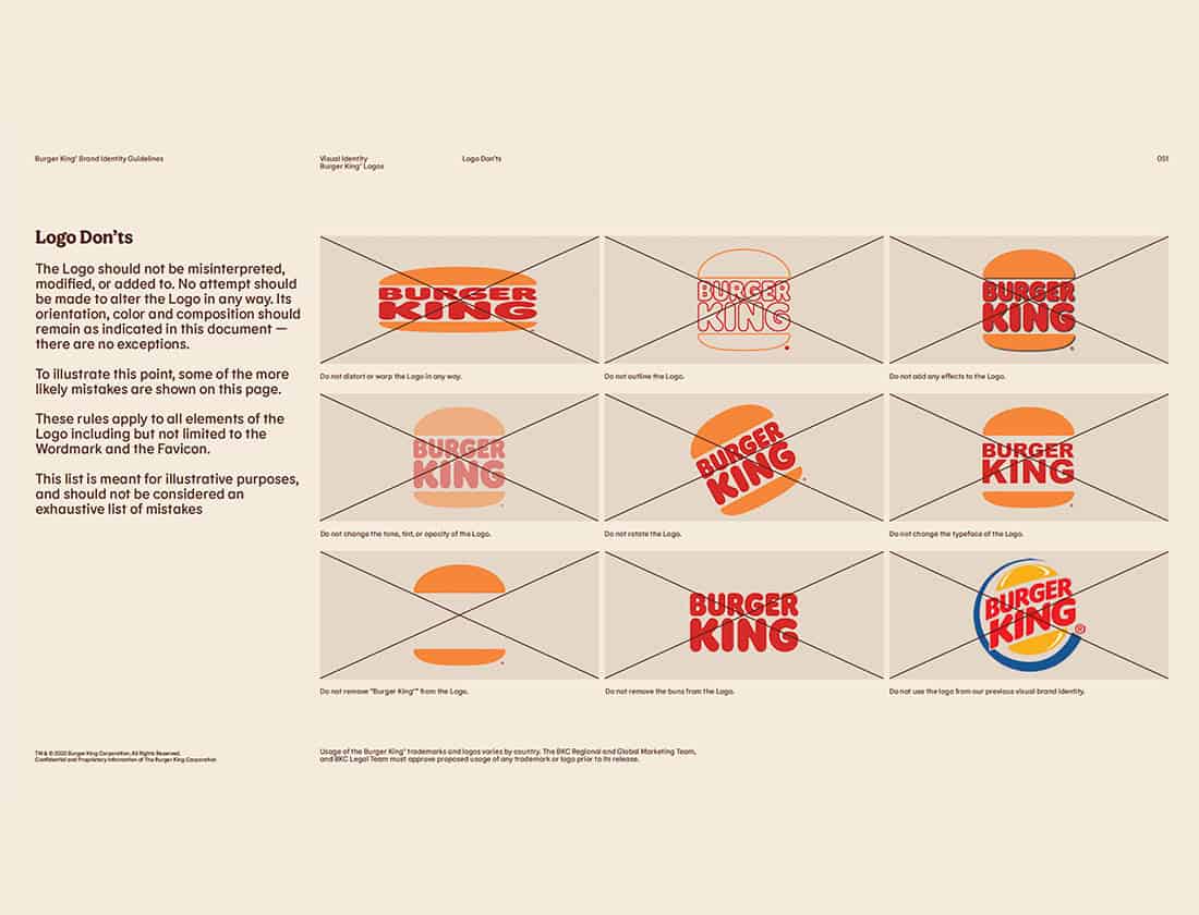
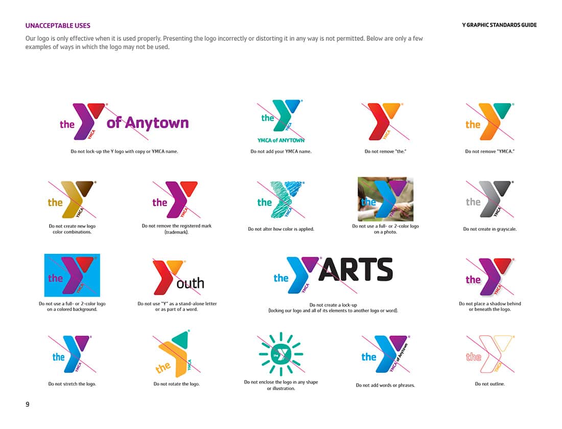
Establishing guidelines for what not to do with a logo is also an important part of logo usage guidelines. These “don’t do’s” are essential to maintain the integrity of the brand (the last thing anyone wants is Drew from Accounting thinking they can use MS Paint to recreate the logo in their favorite color), and candidly they are one of my favorite parts of a brand style guide … but I’m getting ahead of myself.
New Meridian's logo guidelines provide an overview of the various configurations and colorways of the logo.
Logo clear space settings and minimum size requirements for the Long Center logo.
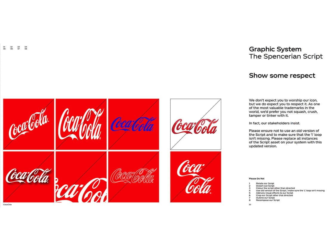
One of the world's most recognizable brands, Coca-Cola's workmark maintains visual consistency regardless of language.
This page from T-Mobile's brand guide provides a thorough examination of updated details of the logo.
Basing clear space on the height or width of a individual element within a logo is a common practice, as shown in the example from Burger King's brand guidelines.
Logo clear space settings and minimum size requirements for the Kia logo.
Alaska Airlines uses the height of the "k's" ascender as the unit of measure for its logo clear space.
The proportional clear space formula and clear space exceptions from the American Express brand guidelines.
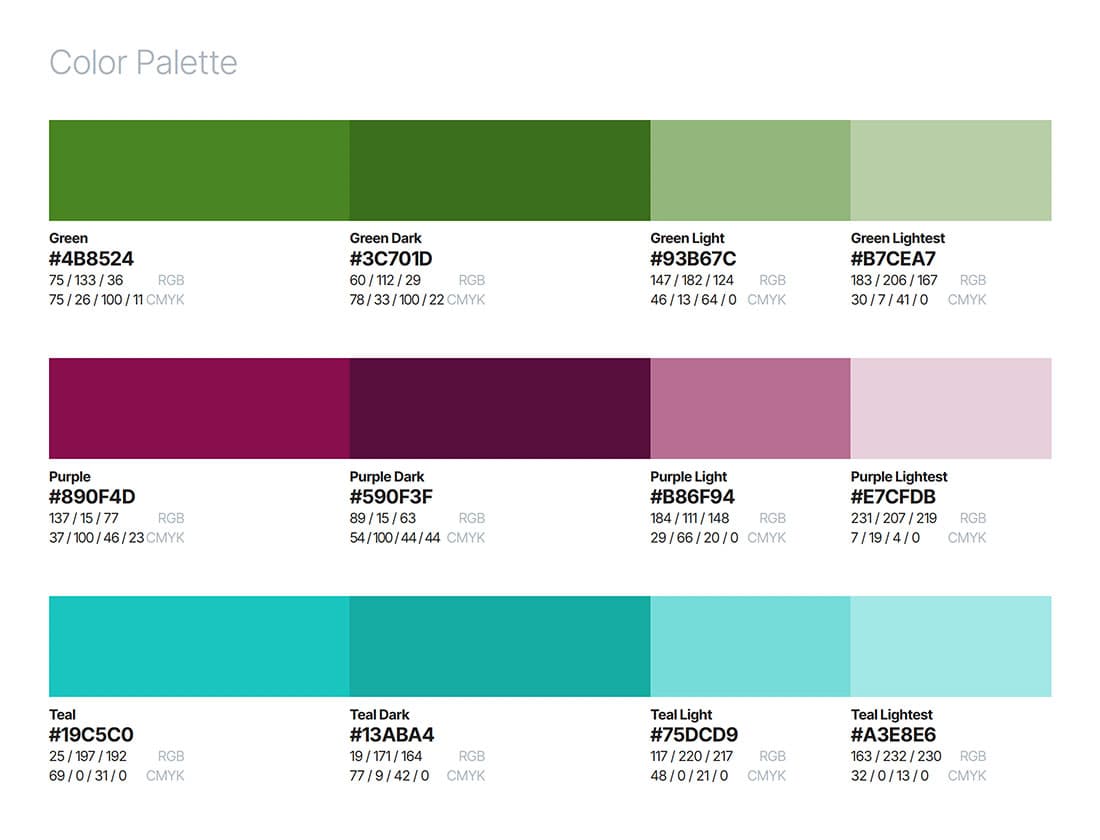
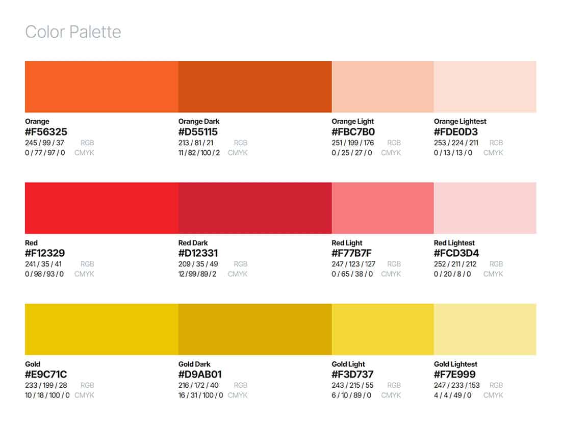
Color Palette
What can brown do for you? I bleed burnt orange. The perfect blue box. When you think about well-known brands, color is often the first thing that comes to mind. It’s no surprise that providing detailed specifications about color palette is a very important part of a company’s brand identity guidelines.
For example, Tiffany and Company has not only trademarked their famous robin egg blue, but they also worked with Pantone to find just the right color they were looking for, and in the process, the color got a custom Pantone number – 1873, the year the company was founded. Several other companies have trademarked a shade they became known for, staking claim to a color. UPS brown, Barbie pink, T-Mobile magenta and 3M (Sticky Note) yellow are just a few of the most well-known trademarked Pantone colors.
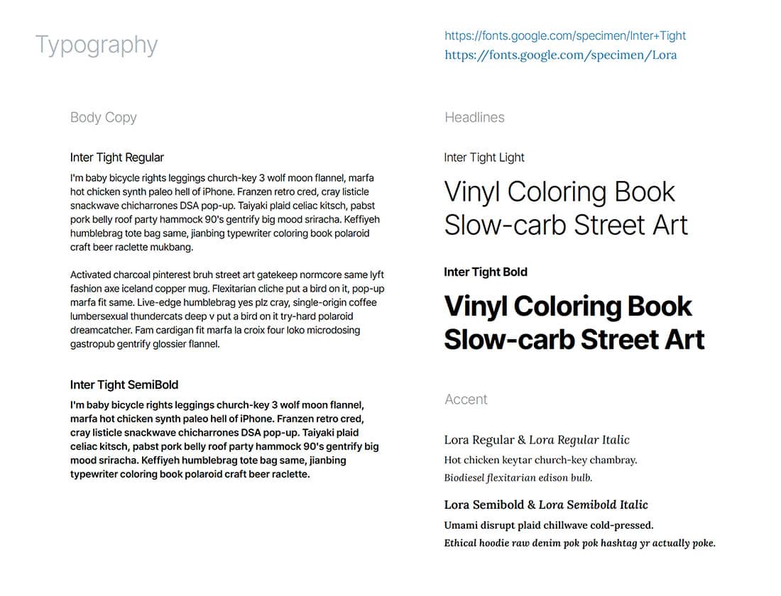
Typography Guidelines
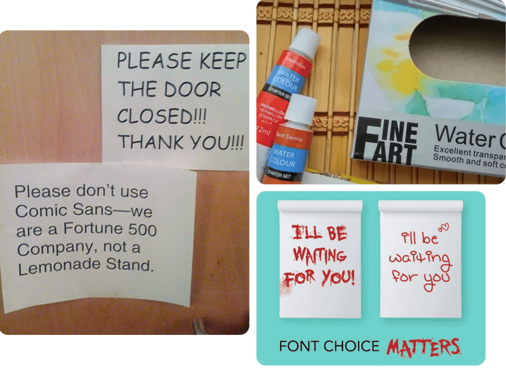
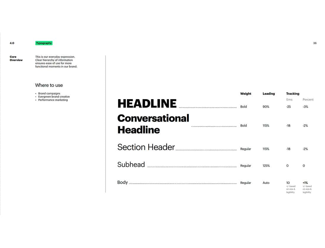
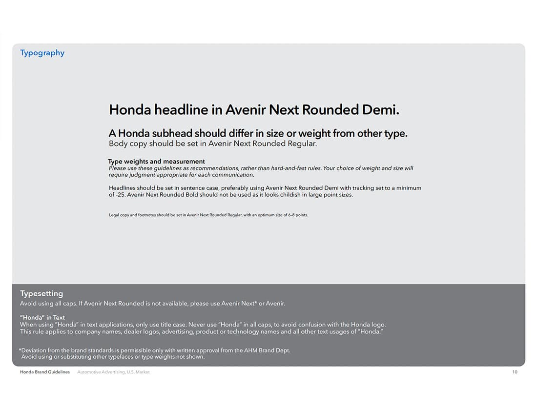
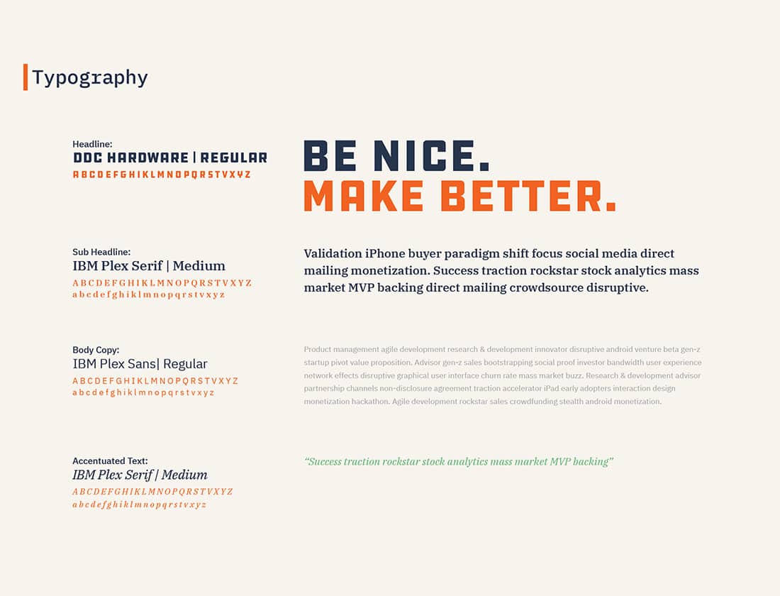
Hopefully, you’ve seen enough funny memes to realize that typography and font selection matter. I often think of the role of typography in design as being the sound of the voice of the words being displayed. As such, the typography used in a brand’s messaging matters quite a bit (as we covered in this journal entry). The typography portion of a brand style guide typically shows examples of the fonts by the brand and describes how the fonts are used. Perhaps certain fonts are only used for headlines, while body copy should be set in a different typeface. It’s not uncommon to show example text for various headline and text styles, including specifications for size, tracking, kerning, and color.
Brand guidelines will often have distinctions for which fonts should be used in professionally designed printed materials, which fonts are for online web usage, and which fonts are acceptable alternatives for use in Word documents and PowerPoint presentations. That can come in handy when Drew from Accounting needs to write letters to clients who haven’t paid their invoices. Sure, those letters might sound like ransom notes, but they probably shouldn’t look like ransom notes!
This page from Hulu's branding guide provides a useful visualization for typographic style guidelines.
Honda's brand guidelines provide examples and specifications for typography usage.
If you've read this far, you're hopefully already family with Seventh Scout's own typographic platform.
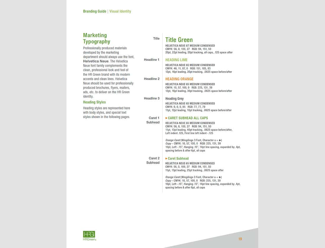
Typography hierarchy examples and detailed formatting specifications are found in HR Green's branding guide.
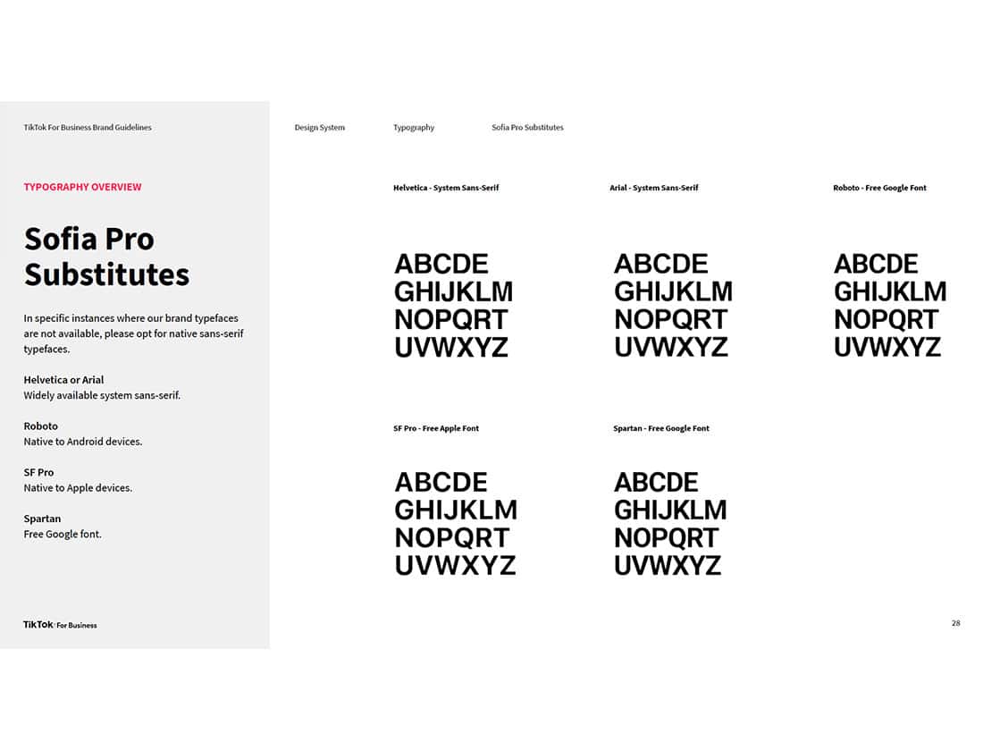
A great example of subsitute fonts from the TikTok For Business Brand Guidelines.
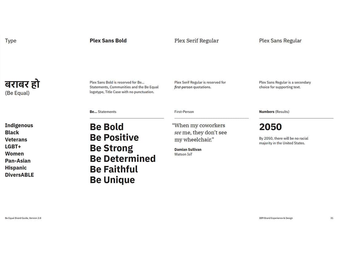
Grammar and style guidelines from IBM's "Be Equal" brand guide.
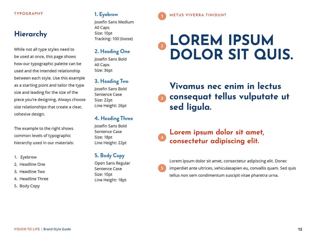
This page from the Vision To Life brand style guide depicts typographic hierarchy and formatting specifications.
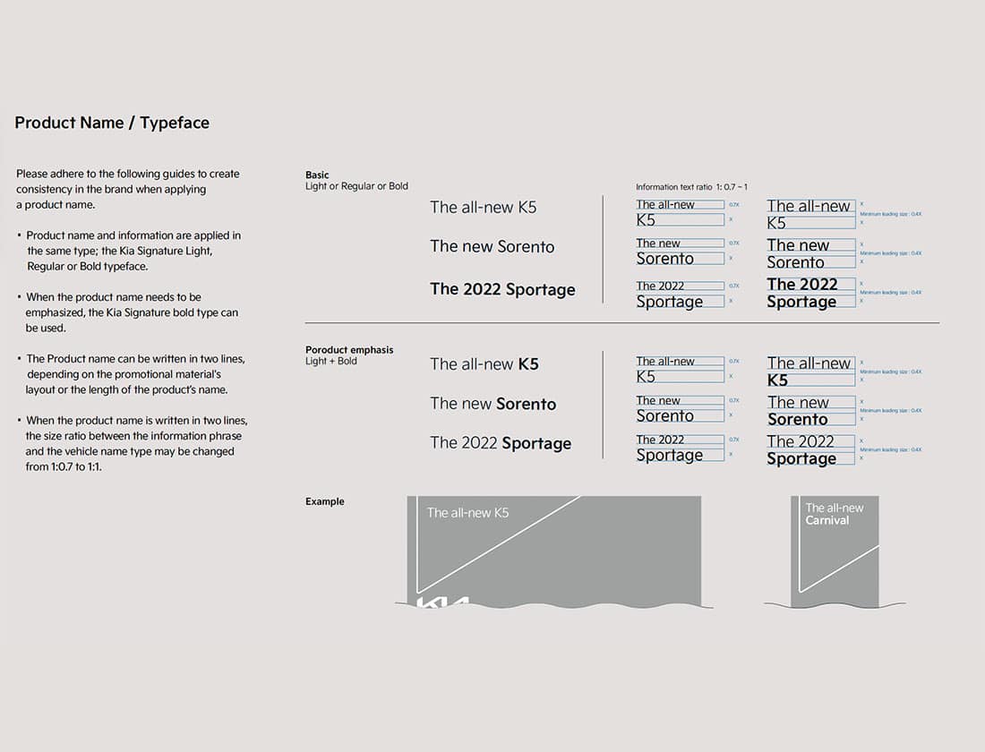
Guidelines and examples of font weight usage from the Kia brand style guide.
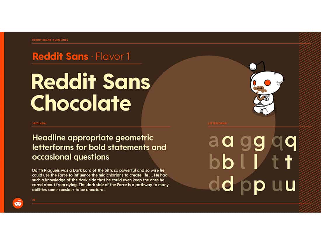
This playful example of typography from the Reddit branding guide depicts alternate characters for certain letterforms.
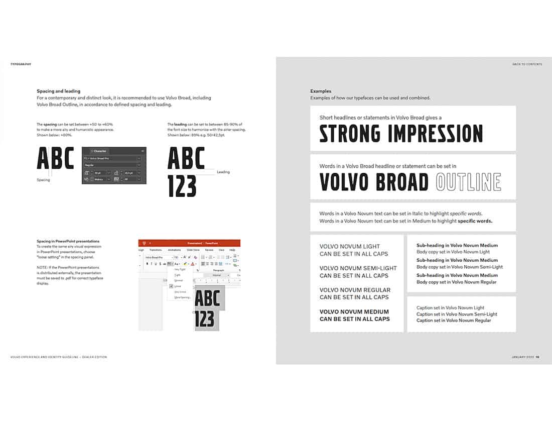
Formatting guidelines and usage examples for the bespoke fonts in Volvo's identity guidelines.
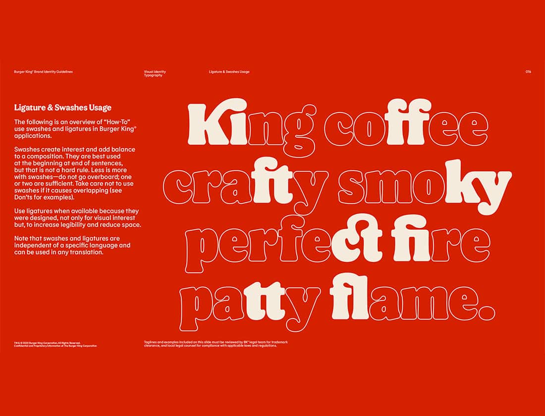
Burger King's bespoke font, Flame Bold includes elegant ligatures. (In typography, a ligature is when two or more letters are joined to form a single glyph.)
I’m gonna take a quick break here to say that brand identities aren’t static. Like pretty much everything else in life, they change and evolve with time. However, I think logos, colors, and fonts (in that order of importance) should be the most stable parts of a brand’s look and feel. Even these elements may change over time, but they are truly the core of a visual identity.
Iconography and Graphic Styles
Another important aspect of brand identity guidelines is documenting and explaining the graphic elements and icons used by the brand. Are certain shapes or graphic treatments an important part of the design and layout or brand materials? If so, the brand guidelines should define these elements and explain how and when they should be used. Ditto for iconography. Some brands use custom-design icons, while others use off-the-shelf clipart and stock icons. Regardless, including icon style and usage guidelines helps to maintain the consistency of these visual elements.
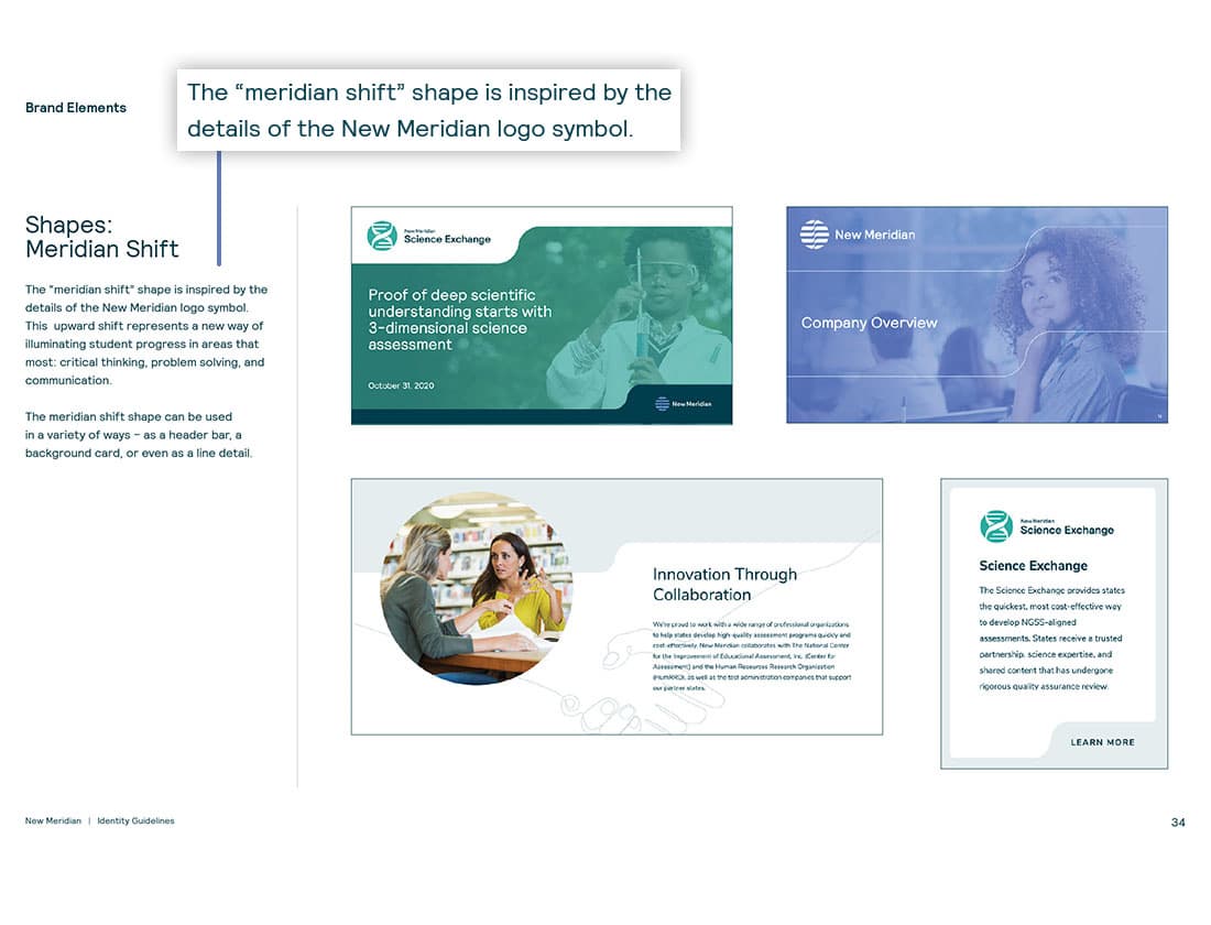
Seventh Scout's riff on a detail from the New Meridian logomark inspired a visual motif that is used across the brand.
Bespoke icons can be represented with three different treatments as seen in the Vision To Life brand style guide.
The "slash" that is fundamental to the taxonomy of Reddit's "sub-Reddits" also serves as a graphic element that can be used in several different ways.
Subtle adjustments to spacing and line weight differentiate the icons Alaska Airlines uses in digital versus print.
Kia uses isolated parts of their logo as graphic motifs that inform compositional balance.
Color and visual characteristics allow Hulu's iconography to become an integral part of their brand language.
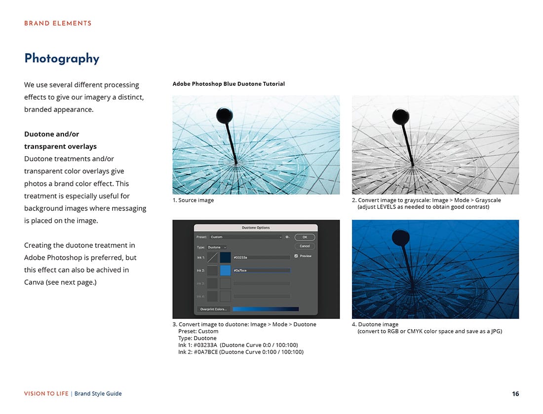
Photography and Illustration Guidelines
You know what they say, a picture is worth a thousand words. As such, brands often include photography and illustration guidelines in their brand guides to ensure the imagery included in their marketing materials aligns with the tone and personality of the brand. Sometimes these guidelines pertain to subject matter, tonality, and composition. In other cases, the guidelines may actually be instructions for customized processing to create branded imagery.
Templates and Examples
It’s not uncommon to include examples of the brand “in action” within an identity guidelines document. Many companies will include stationery samples, brochures, signage, vehicle livery, and more to demonstrate how their branding is applied across various uses. I think this is where brand guidelines can sometimes veer into the hypothetical, with the designers showing how the look and feel could be applied to, say, office building signage or the tail section of a jet plane. But I’m here for it because even a what-if application of branding helps to further solidify our understanding of the look and feel. Grid systems and materials templates are useful ways to ensure that new communication pieces adhere to the visual guidelines of a brand.
Let’s See Some ID
If it sounds like brand style guides include a lot of information, it’s because they do! To be clear, not every brand needs to create guidelines for all of the elements described above.
Here at Seventh Scout, there are occasions where we’ve created a logo and a few initial communication materials for a client but haven’t yet created enough pieces to warrant a comprehensive brand style guide document. After all, the contents of a brand style guide should be mainly specifications for existing, known communication materials rather than rules about hypothetical applications (although a certain amount of hypothetical brand usage is typical, as we’d discussed in the Templates and Examples section.
When we’re at that “not quite ready for the whole enchilada” stage, we make something we call an “Identity Card” – a 1-2 page PDF that provides an overview of the brand logo in all of its various formats, specifications for the brand color palette, and we’ll often include some typography guidelines as well. These Identity Cards serve as a useful touchstone for both our team and our client as we work together to create additional materials that will ultimately flesh out a more complete set of guidelines.
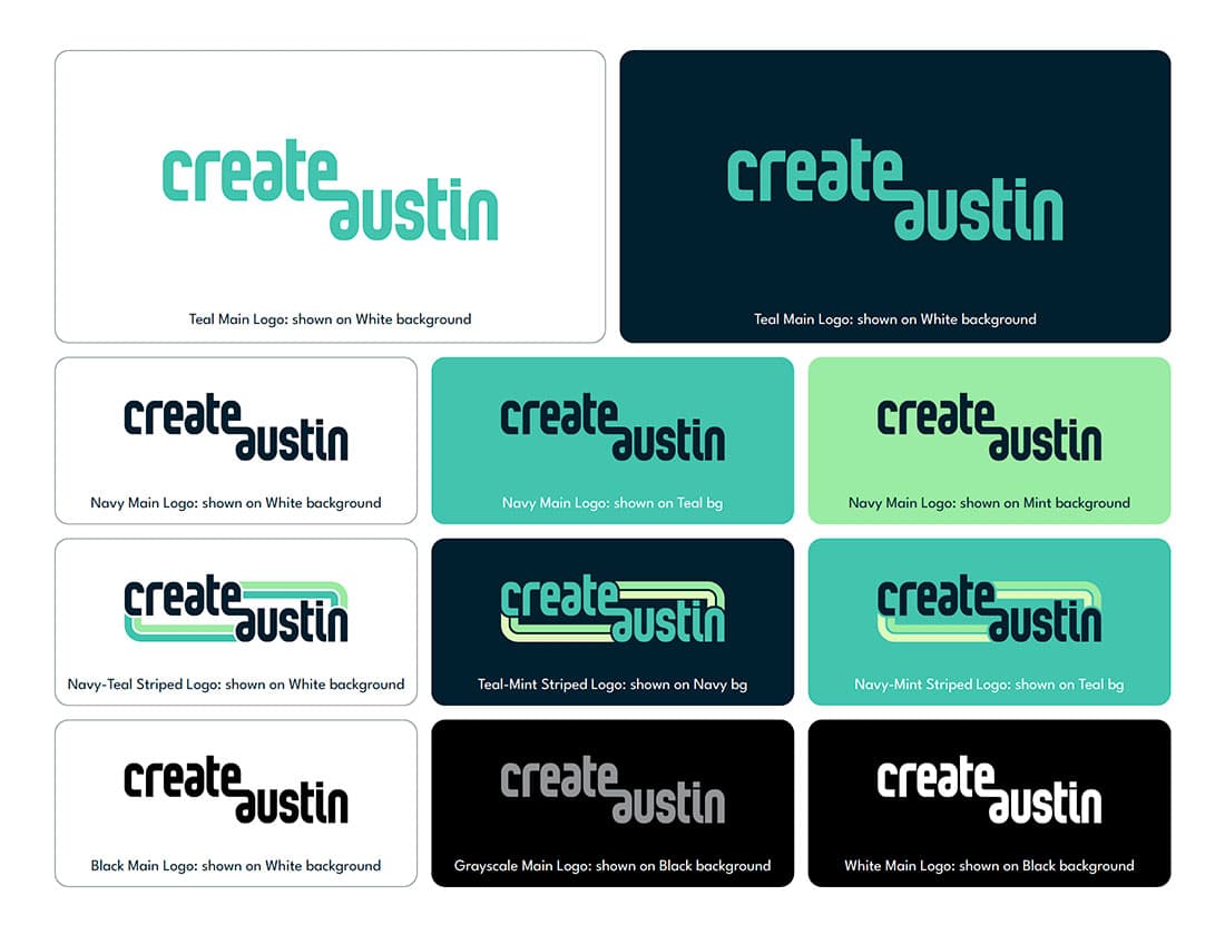
Create Austin logo variations
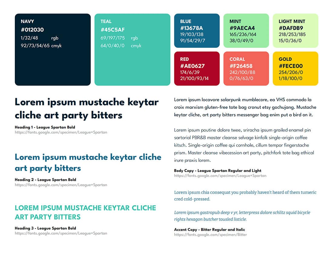
Create Austin color palette and typography
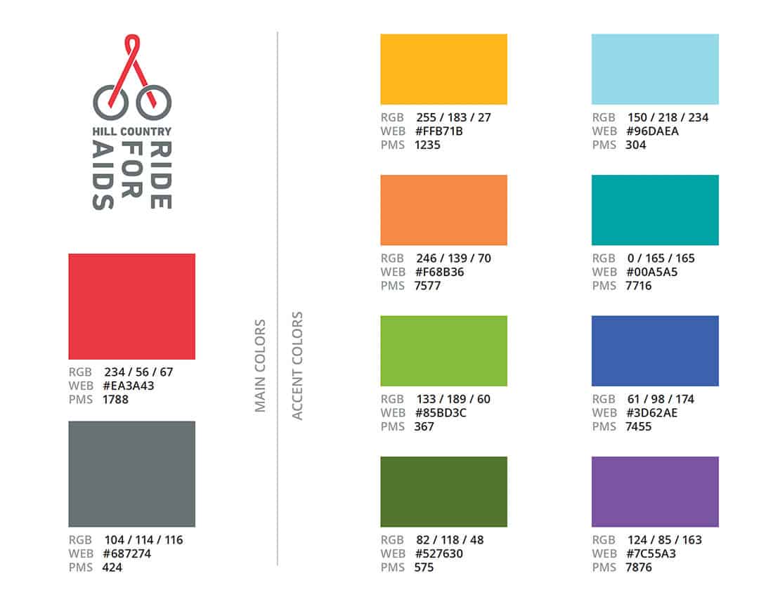
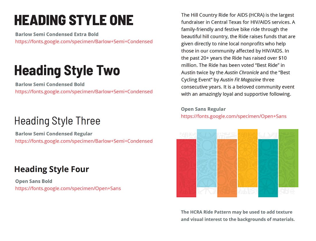
Hill Country Ride for AIDS color palette
Hill Country Ride for AIDS typography
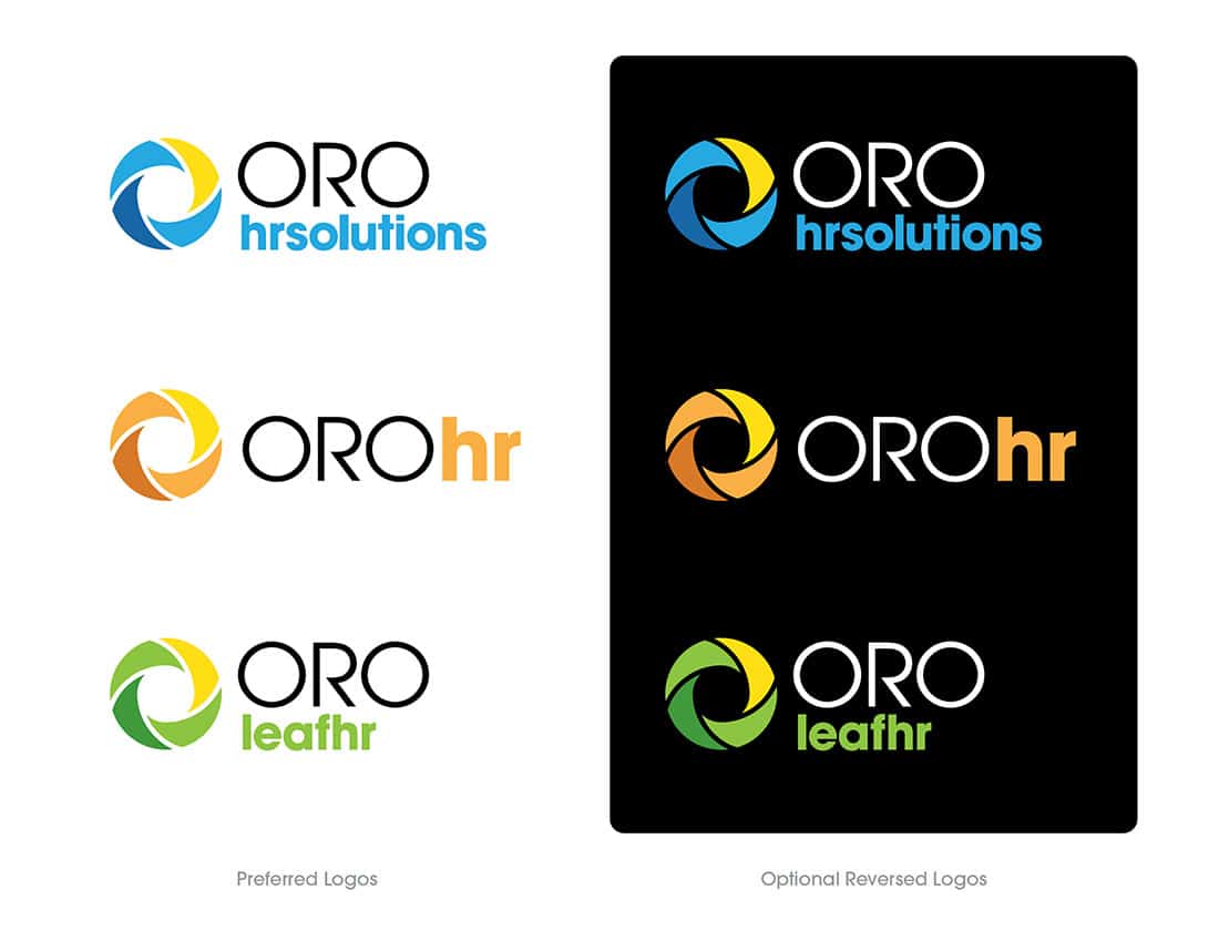
ORO logo variations
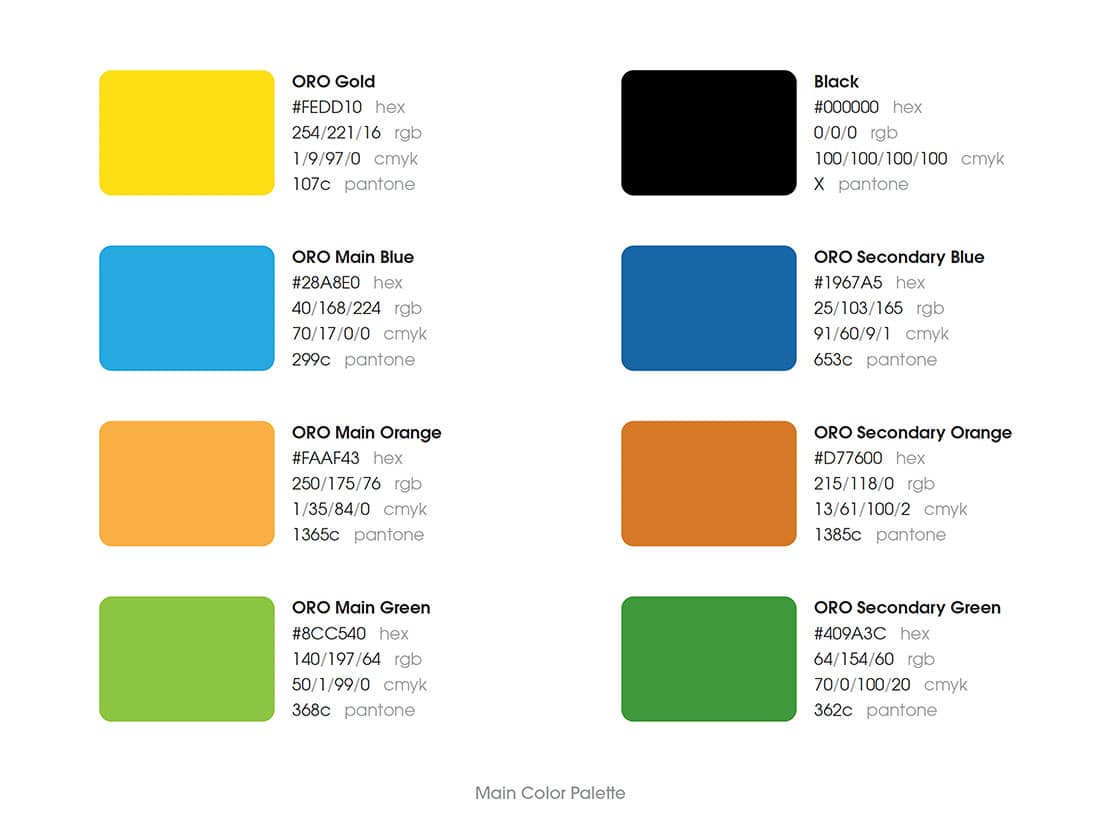
ORO color pallette
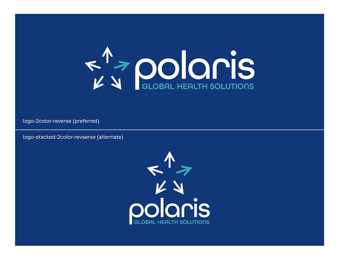
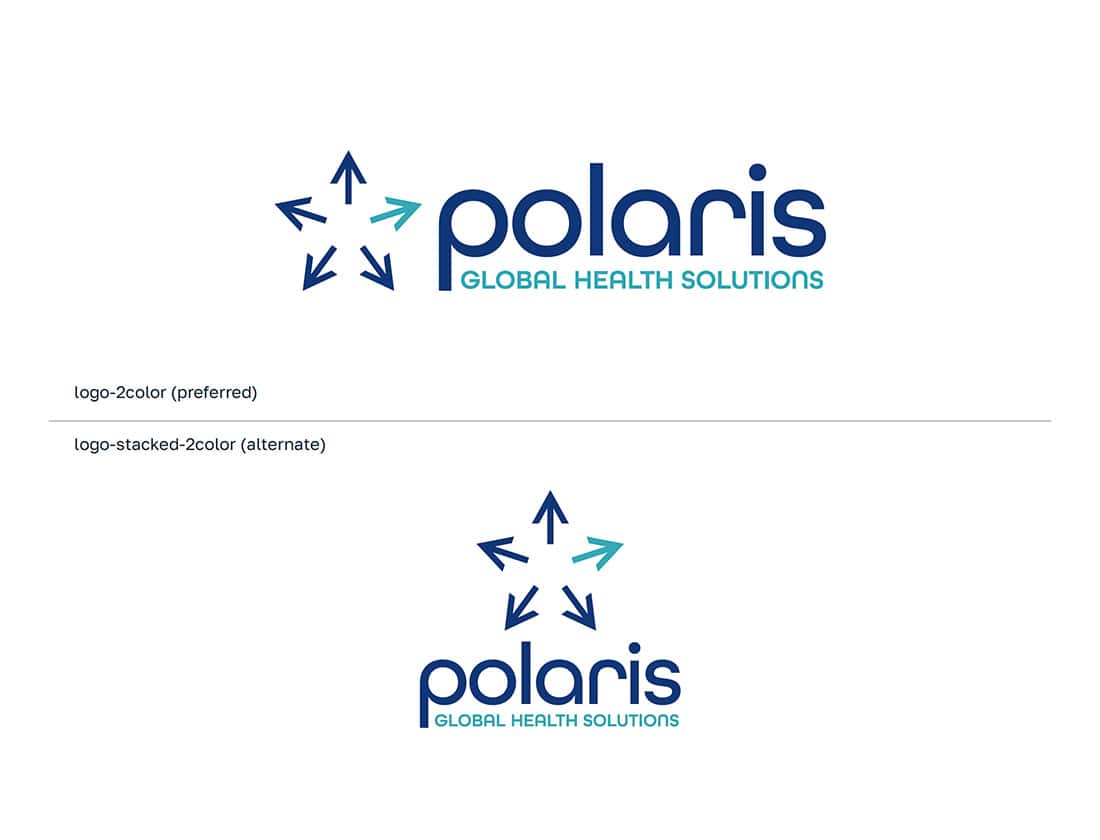
Polaris Global Health Solutions logo variations
Polaris Global Health Solutions logo variations
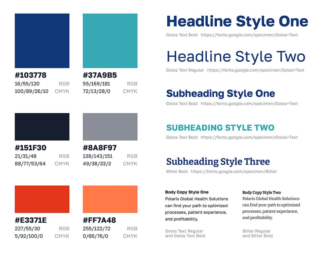
Polaris Global Health Solutions color palette and typography
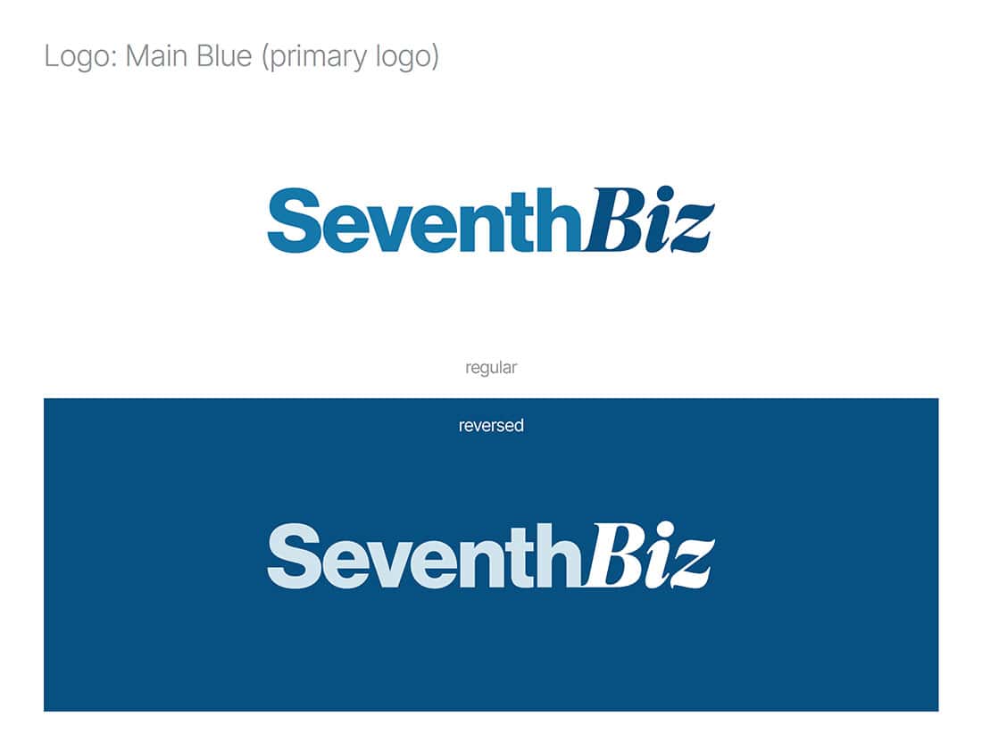
SeventhBiz logo variations
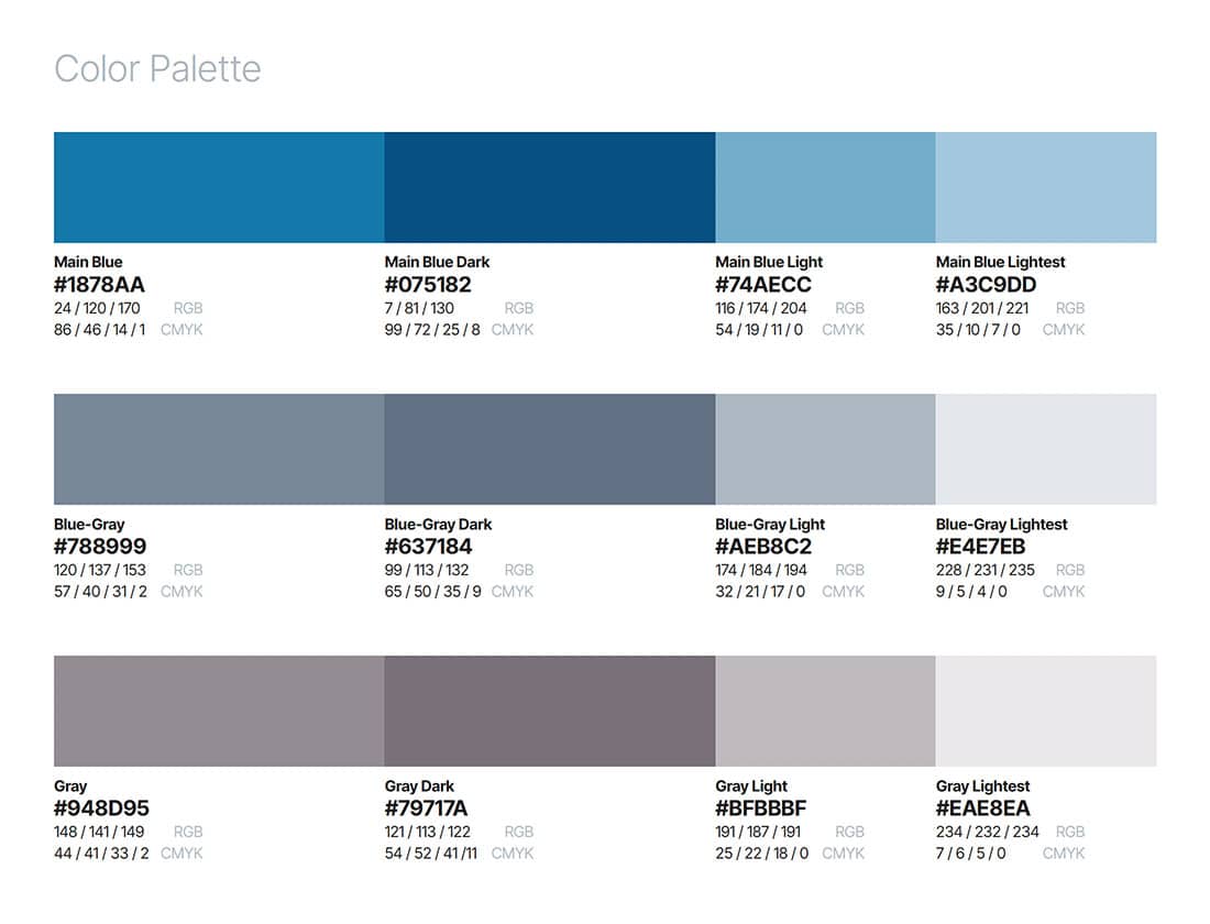
SeventhBiz color palette
SeventhBiz color palette
SeventhBiz color palette
SeventhBiz typography
Who Uses Brand Identity Guidelines?
Hopefully, every employee of a company or organization has access to its brand style guide, even if their day-to-day roles and responsibilities don’t revolve around the visual aspects of the brand (I’m looking at you, Drew from Accounting). Frequent users of identity guidelines include folks with roles in design, marketing, media, and communications. They either utilize the brand guidelines in their own creative work (in the case of in-house graphic designers) or share them with external partners (such as advertising agencies, design firms, media partners, and other vendors) to ensure the materials being produced are on-brand.
Let’s Wrap This Up
In this journal entry, I’ve included examples from brand identity guidelines and identity cards that we’ve created here at Seventh Scout as well as examples published at The Branding Guidelines Archive, a treasure-trove of style guide yumminess. Before I sign off, I’d like to take a moment to take a closer look at some of my favorite aspects of brand style guides.
How To
I’m always fascinated by brand guides that contain detailed instructions for how to design and create highly specific brand elements. Whether they’re instructions for custom photographic processing settings or motion and animation guidelines for time-based media, I love getting a sneak peek into how the sausage is made.
Vision To Life's brand style guide includes detailed instructions for creating brand color duotone photo treatments.
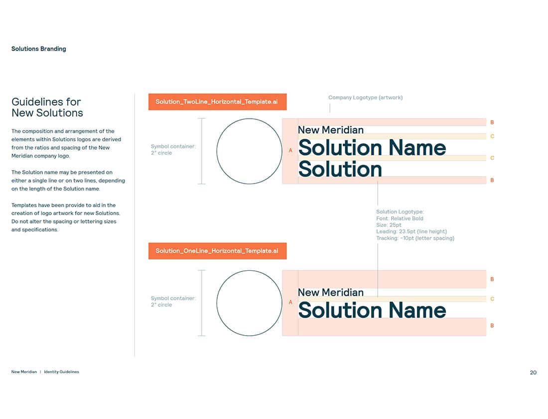
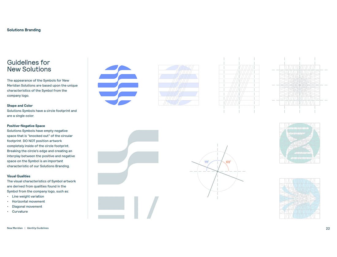
Details and templates for creating solution branding are a part of the New Meridian identity guidelines.
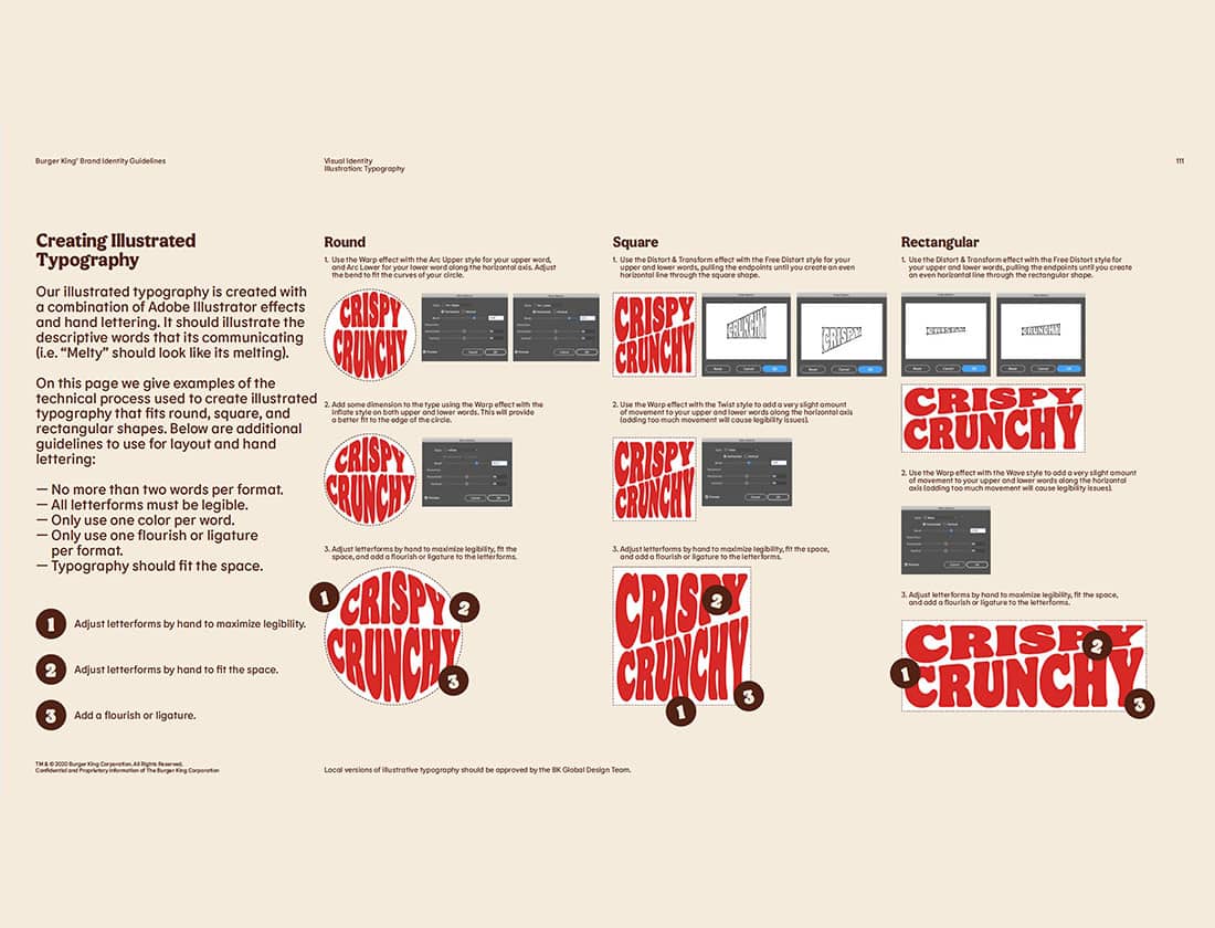
Burger King provides examples and instructions for creating illustrated typography in its brand identity guidelines.
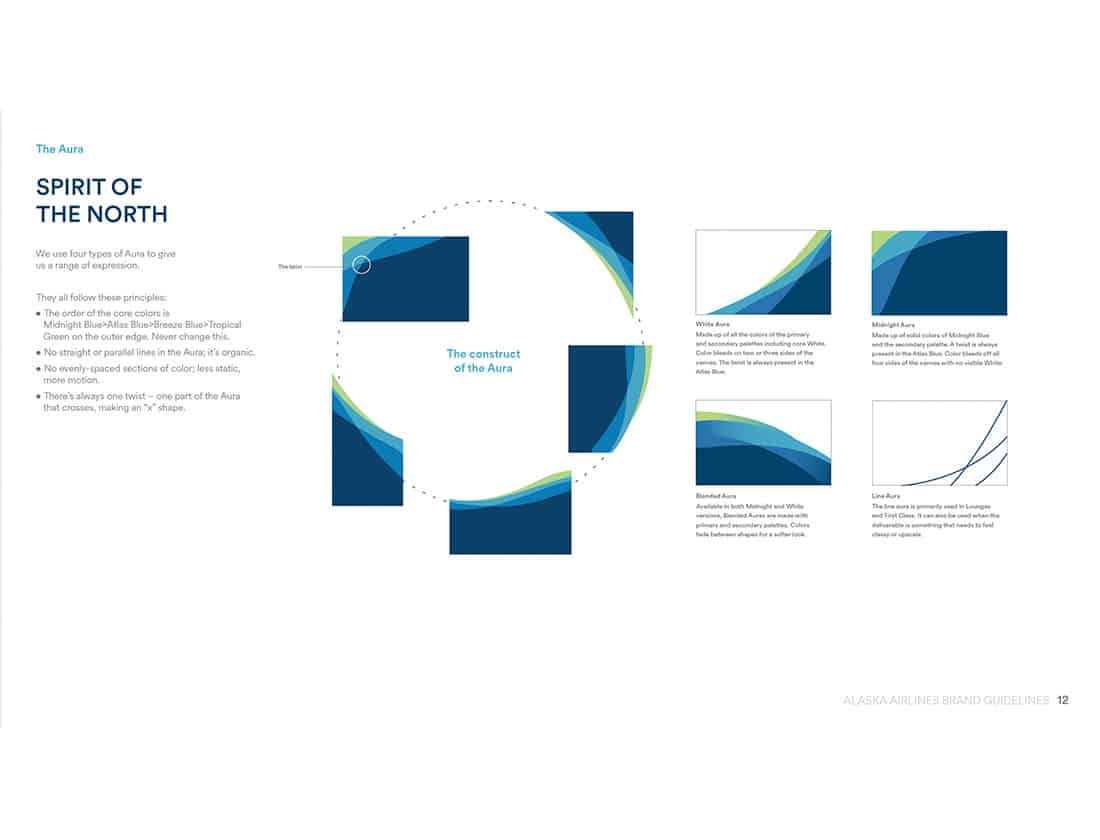
The details and construction the "Aura" visual is explained in the Alaska Airlines brand guidelines.
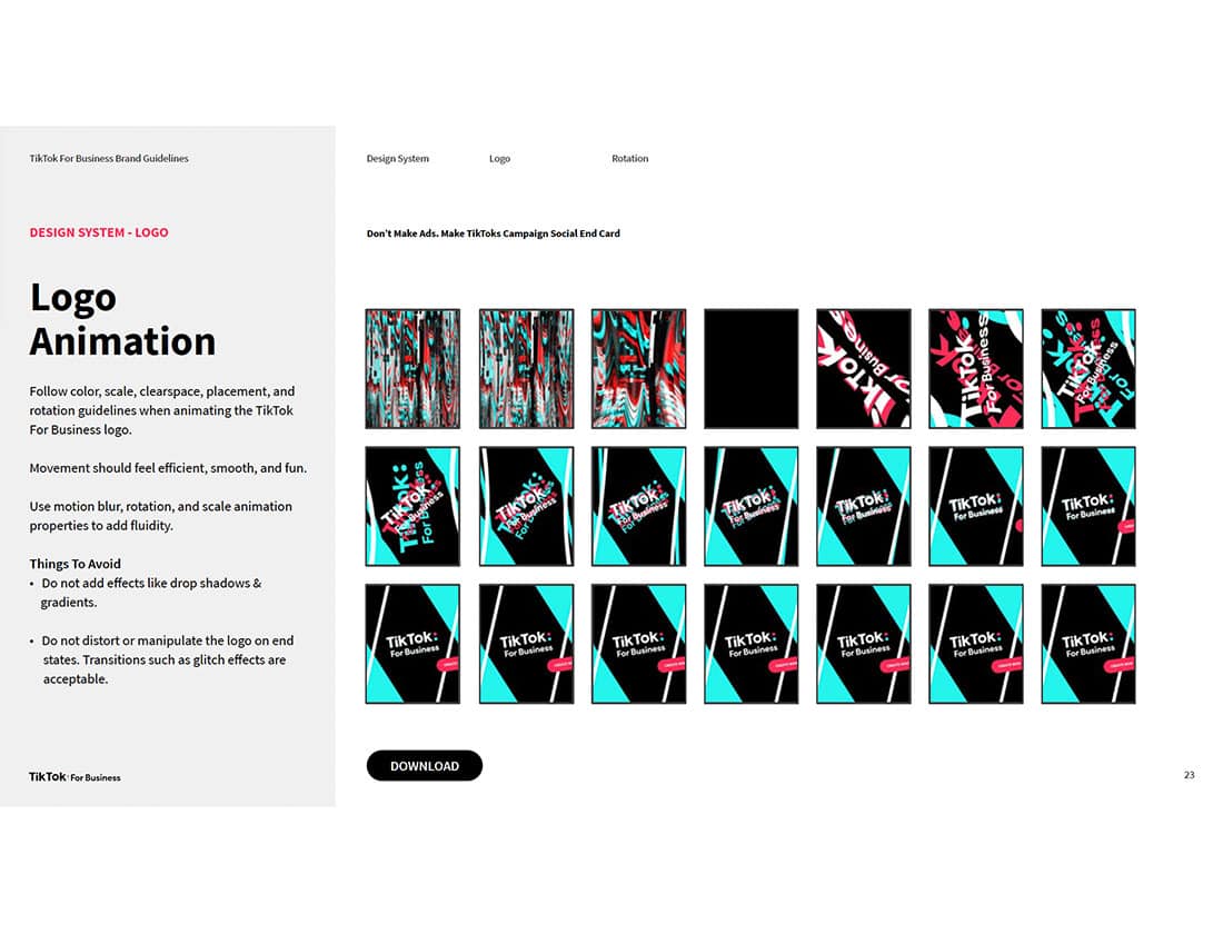
Logo animation guidelines are part of the brand guidelines for TikTok For Business.
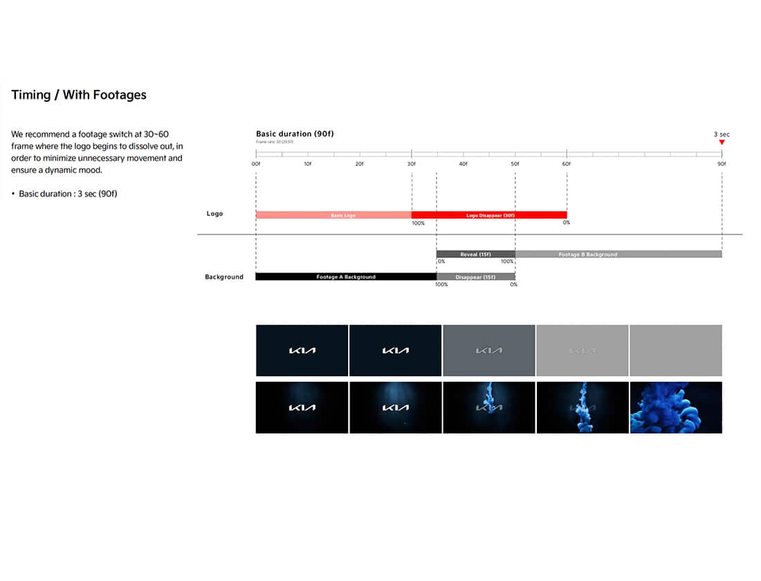
An example footage timing is part of a larger set of Kia's guidelines for motion graphics.
Don’t Do!
As I mentioned, this is one of my favorite parts of brand identity guidelines. These here’s what not to do sections provide necessary guardrails that preserve a brand’s integrity. And let’s be honest, sometimes the examples are kind of funny. Every so often, though, I’ll see a don’t do this example that looks so cool that I wish it weren’t against the rules.
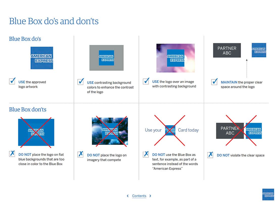
Clear and easy to understand rules from the American Express brand style guide.
Have it your way, except when it comes to messing with the logo.
Make sure it's the real thing.
Not gonna lie, I like #5 the drop shadow a lot.
The YARTS are never unacceptable.
Who Knew?
While Brand Style Guides are primarily visual documents, they also typically contain a fair amount of wording and explanation. Show and tell, right? Sometimes guidelines contain really cool explanations of visual aspects or elements whose inspiration or purpose isn’t immediately obvious.
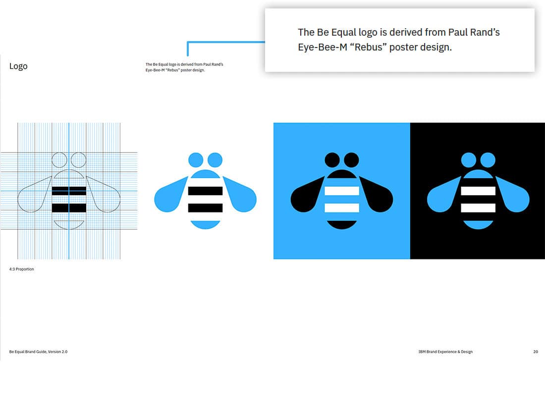
I LOVE LOVE LOVE the subtle equal sign in this homage to the famous Paul Rand IBM rebus.
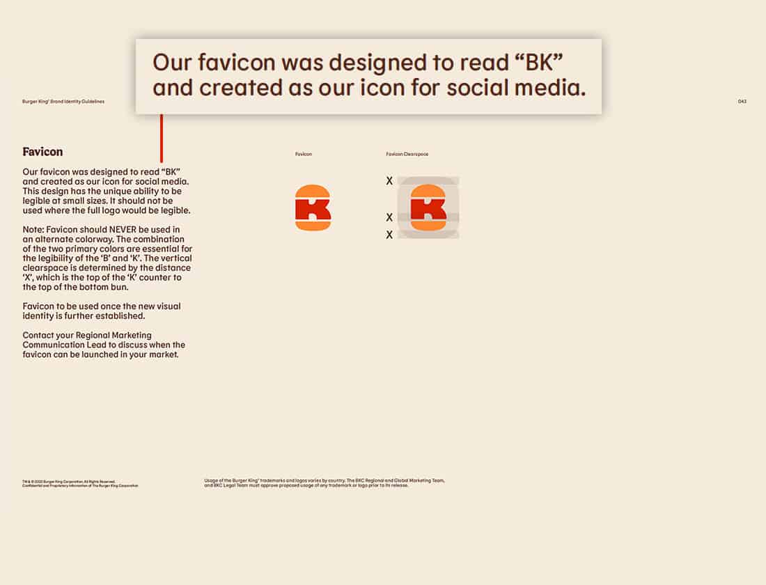
I might not have noticed it if they hadn't called it out, but now I can't un-see the BK in Burger King's favicon.
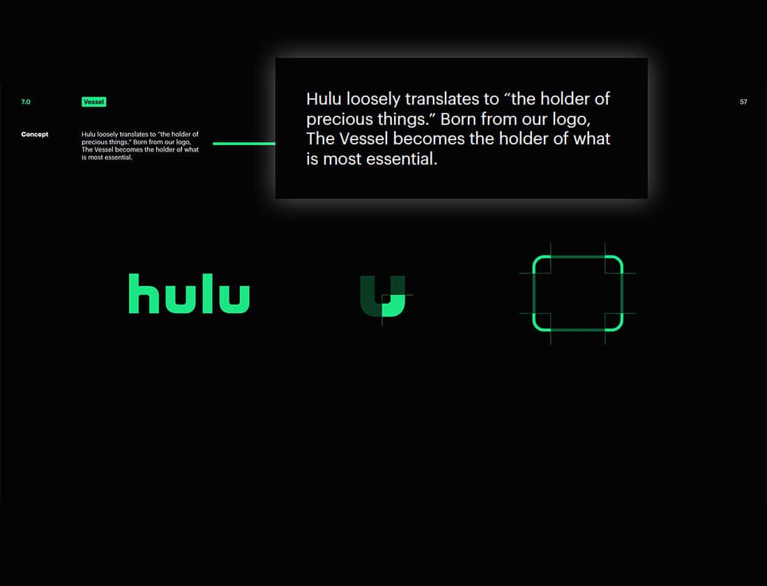
Inspired by the name and the letterforms of the logo, the Vessel is an important part of Hulu's visual language.
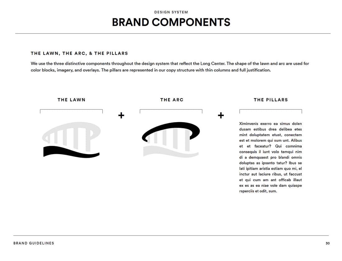
Iconic elements from the building and campus become key brand components for the Long Center.
The visual characteristics of the company logomark are used to inform the branding of New Meridian solutions.
The YARTS are never unacceptable.
Old is the New New
One of my guilty pleasures is nerding out over vintage graphic design stuff. I dig a lot of retro stuff in general and have long been interested in the history of graphic design and typography. The evolution of aesthetic trends and styles throughout the years and how mechanical and technological advances have influenced design are really interesting to me. This next slideshow is all about eye candy. Think of it as a little gift from me to you… And okay, to Drew (from Accounting) too.
[/rhyming]
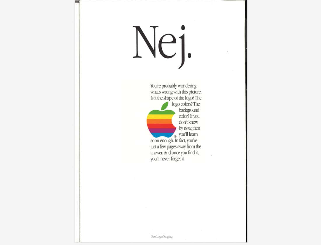
Did you notice how nearly all of the contemporary brand guides have a landscape page orientation? Welcome to 1987, a time when brand guides were printed, physical documents.
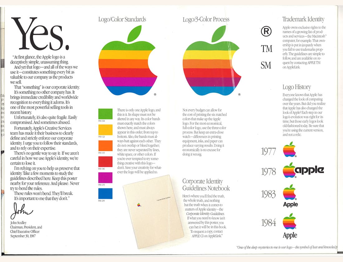
The spot color (6 Pantones!) versus 3-color process printing comparison is pretty cool.
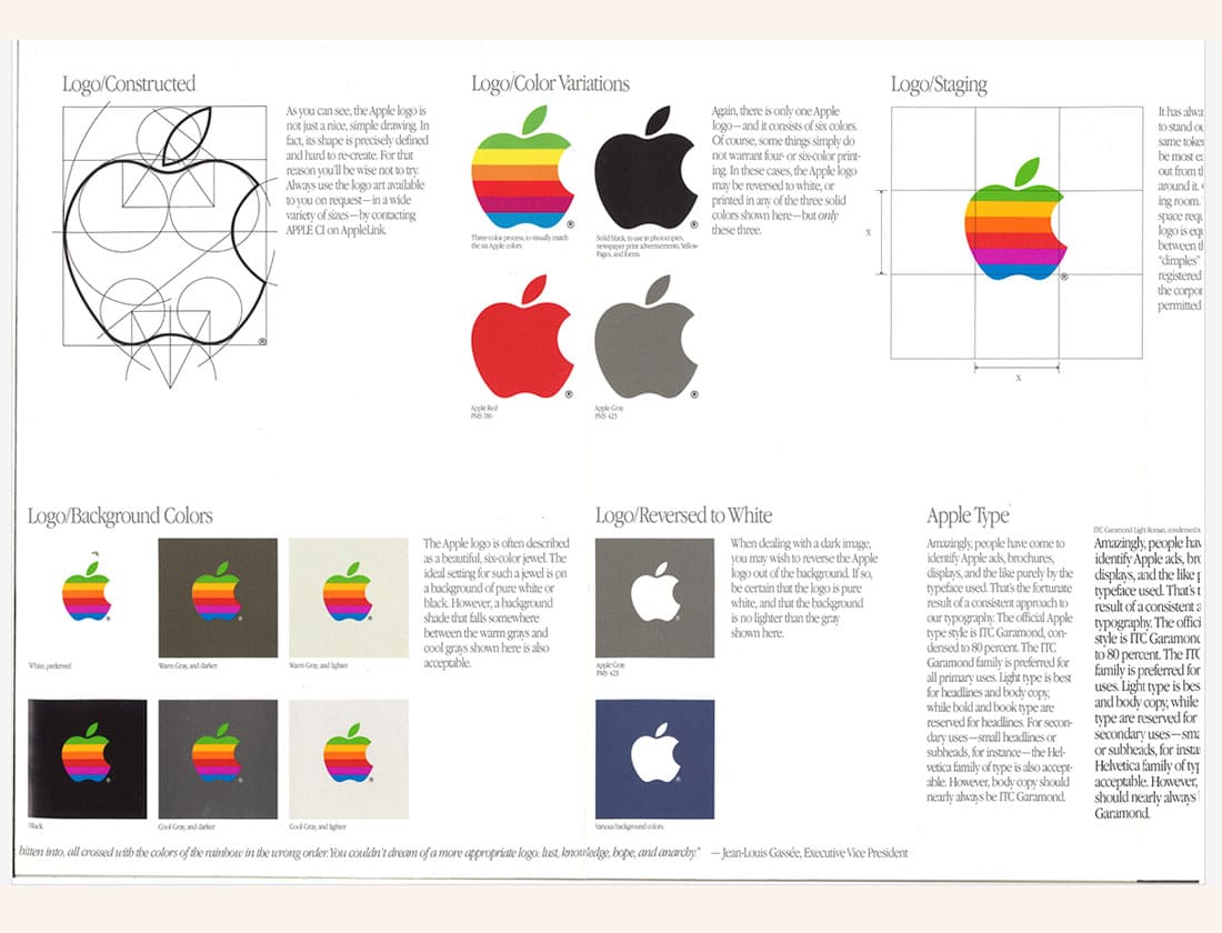
I'm fascinated by the Apple logo construction schematic!
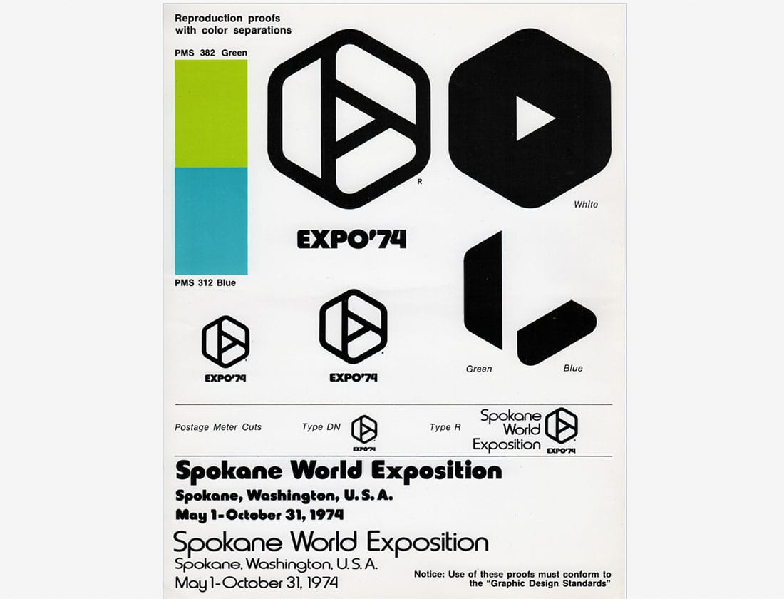
Reproduction proofs with color separations for the Expo '74 logo.
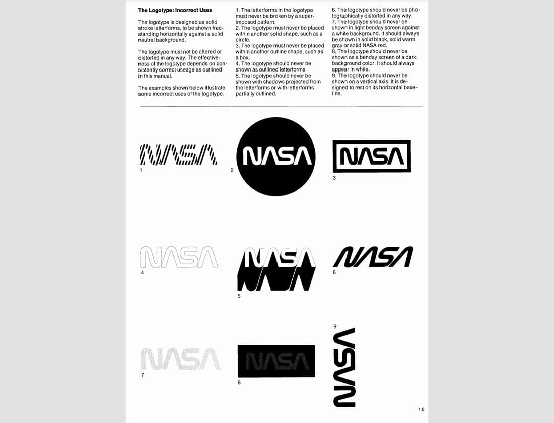
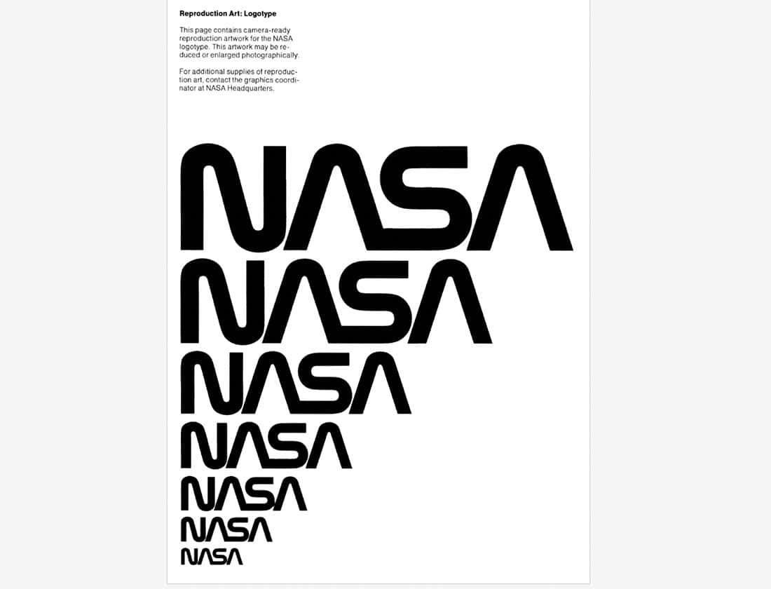
NASA Graphics Standards Manual, 1976. "This page contains camera-ready reproduction artwork for the NASA logotype."
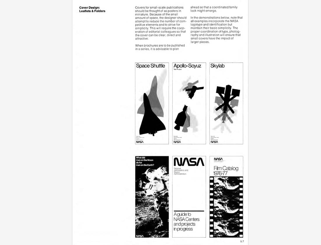
I love the simplicity of these brochure covers. Sometimes all you need is tightly kerned Helvetica Light and bold object silhouettes!
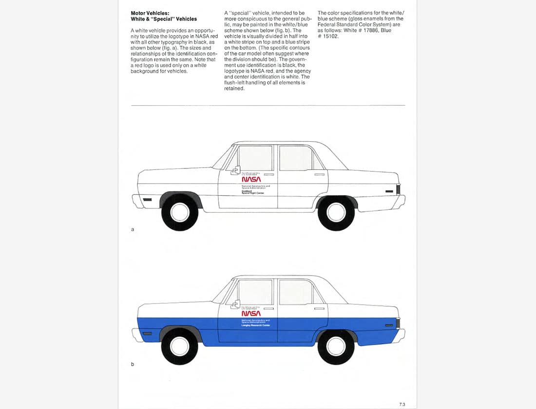
Pretty sure that "Special" Vehicle is just a Dodge Dart. Oh by the way, this NASA logo is known as "The Worm".
The identity guide contains a fascinating examination of the logo creation process.
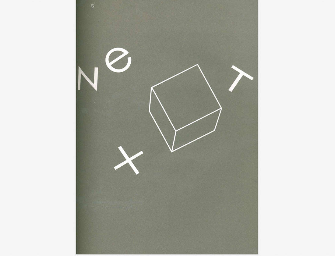
Further exploration of the lower case "e".
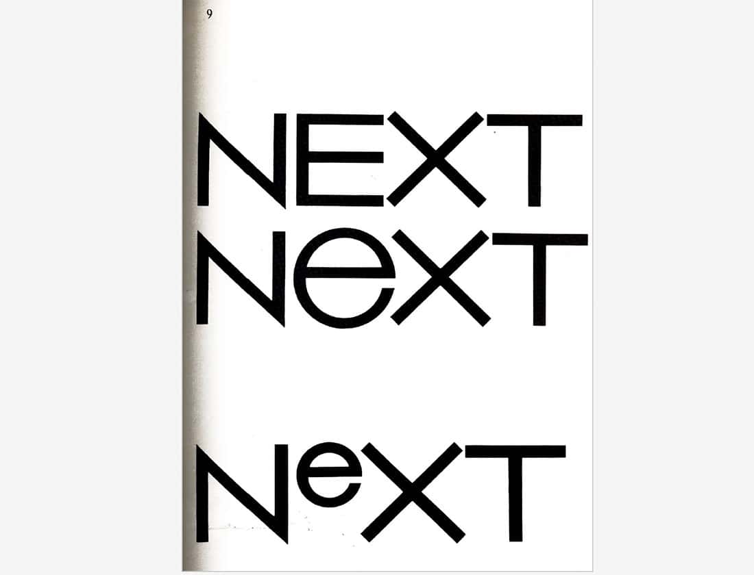
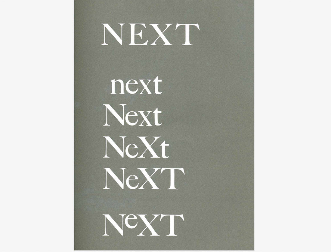
Exploring letter case as a fundamental element of the logo. This is totally one of the things I do when designing a wordmark.
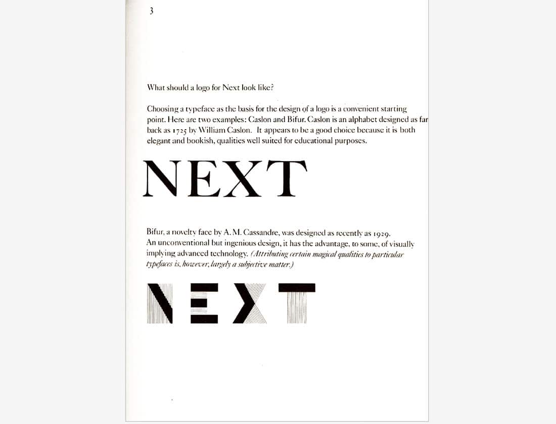
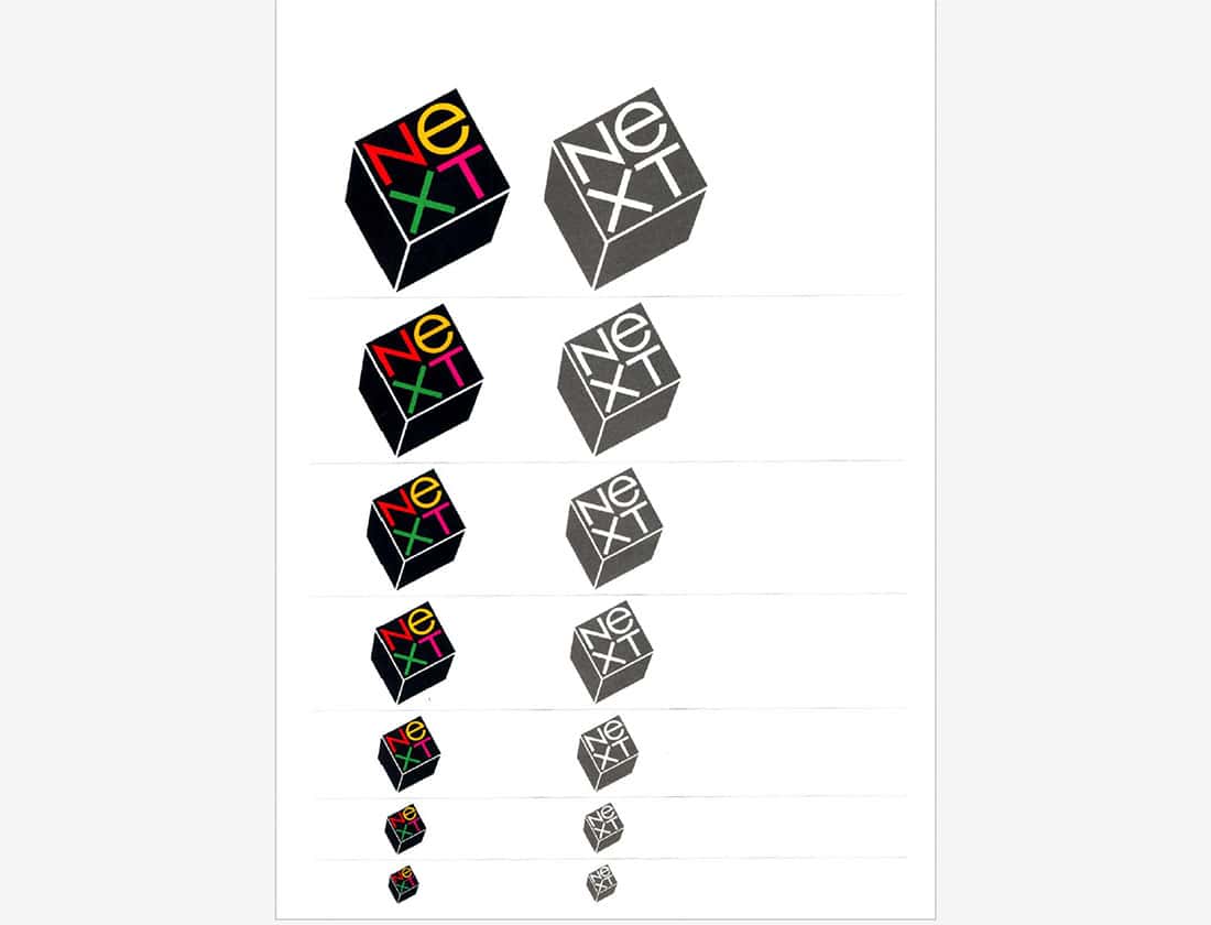
NeXT, Inc. specialized in computer workstations for higher education and business use. It was founded by Apple Computer co-founder and CEO Steve Jobs after he was forcibly removed from Apple in 1985. The identity was designed by the lengendary Paul Rand.
An overview of the final logo showcases legibility at scale and color usage.
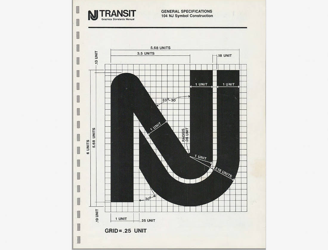
How groovy is this schematic of the NJ Transit logo symbol.
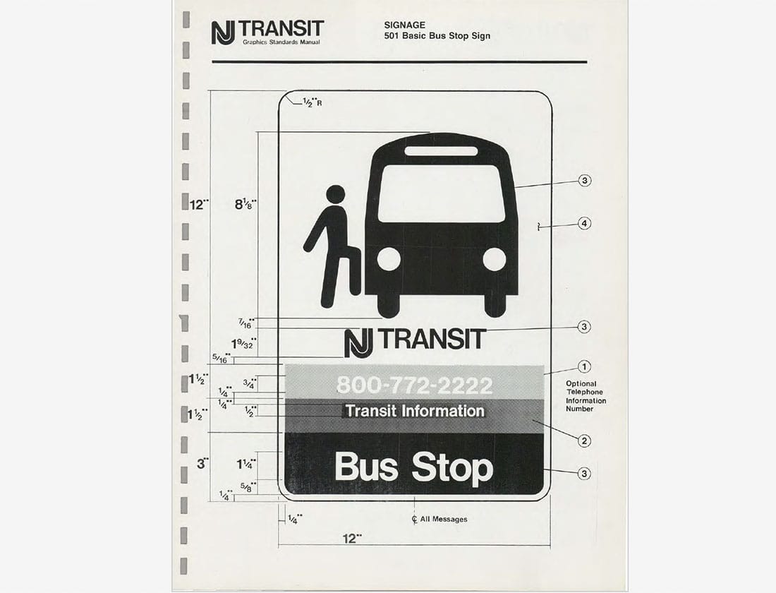
That's the exact same pose I strike when I get on the bus.
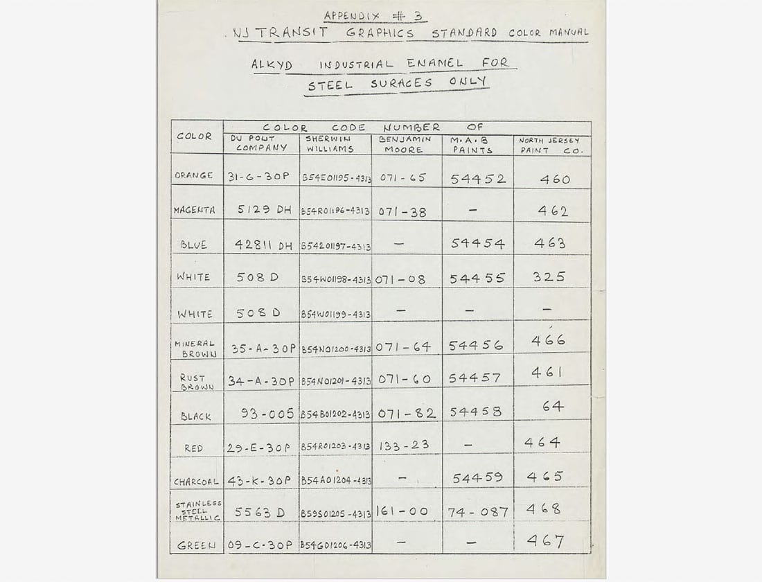
"Appendix #3" is a hand-written insert in the spiral-bound manual showing paint color codes for steel surfaces.
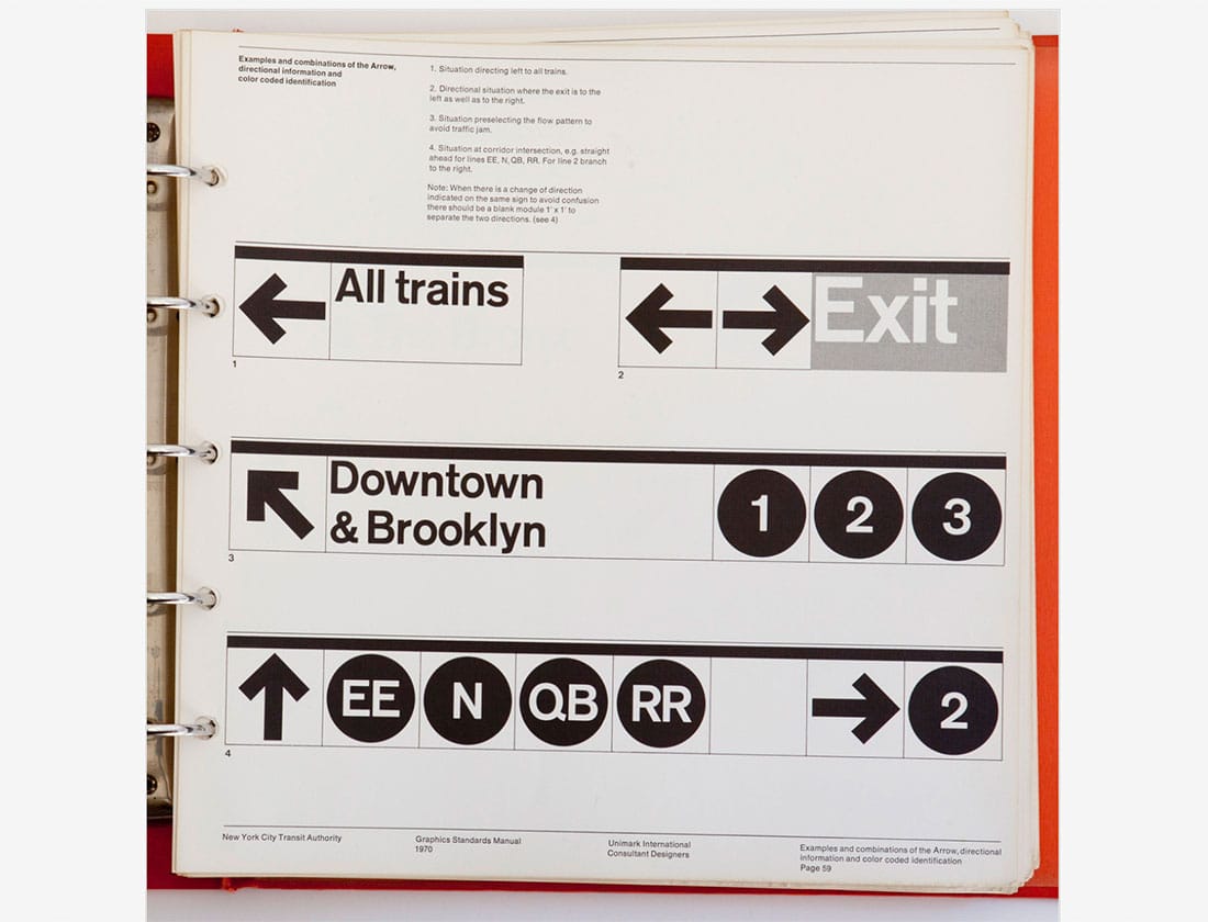
LOVE the details of this signage arrow!
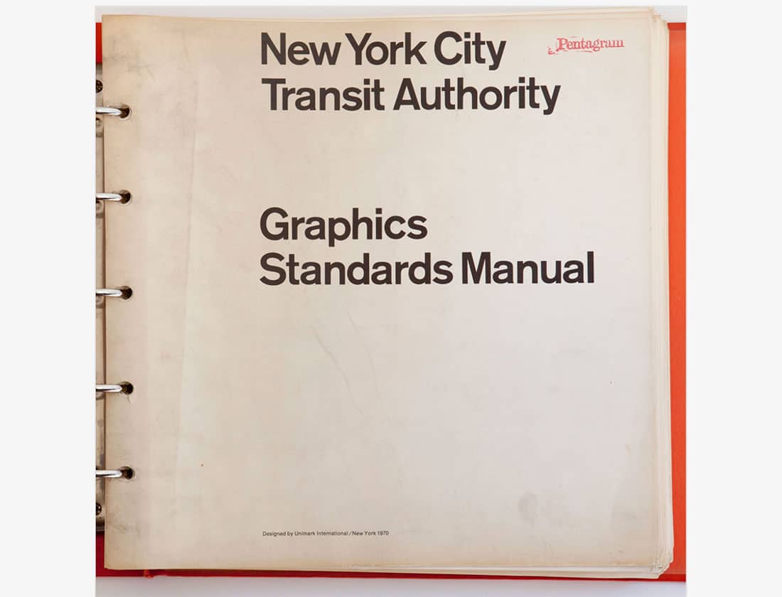
The five-ring binder format of this 1970 graphics standards manual seems like a smart way to easily update the manual.
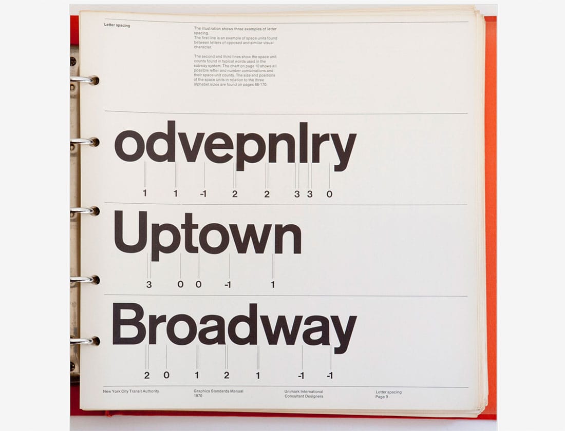
Very detailed letter spacing guidelines!
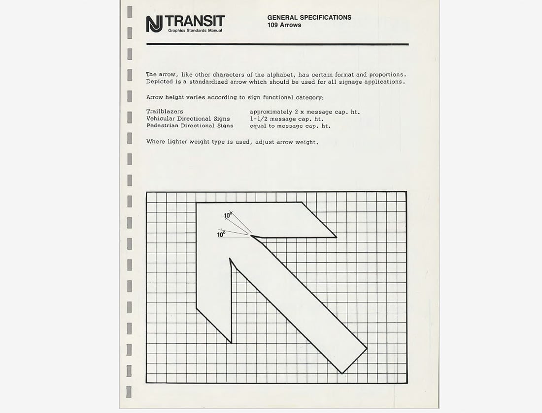
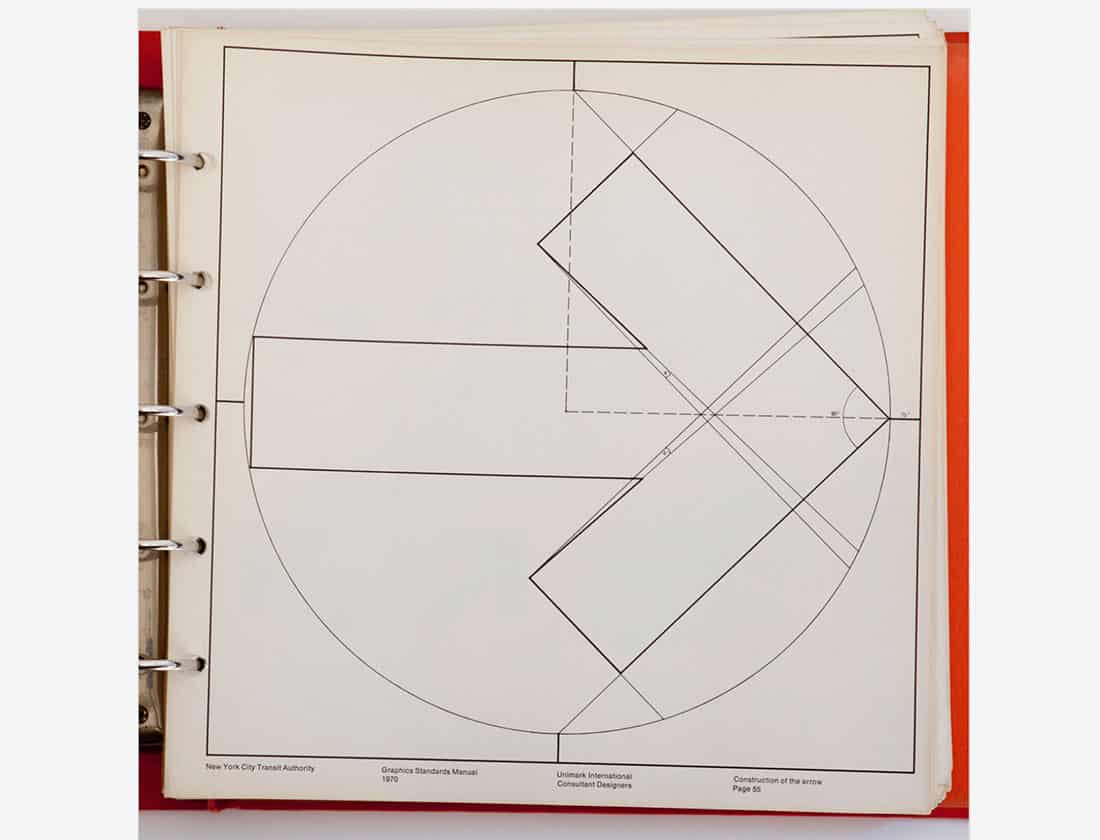
Really digging this schematic of the construction of an arrow.
So classic. So classy.
Eve Molnar
Eve Molnar is a communication designer and strategist at Seventh Scout. She believes that a picture is worth a thousand words, but even so, she doesn't mind writing the occasional journal entry.