Typography
Think about the typographic style throughout your website as the sound of the voice of your content and messaging.
Does your website have a unique typographic style? Is it aligned with your company or organization’s identity and brand guidelines? Does it match the personality and tone of your brand?

It’s not always possible, desirable, or cost-effective to use the exact same fonts on your website as on your printed materials. Some “classic” fonts that work beautifully in printed applications don’t render as nicely on screen, while other fonts require licensing fees for online use. However, many easy-to-implement, high-quality, open-source (free!) fonts are available for web use. Google Fonts is a great resource for finding typography for your website. Typewolf is a website with great suggestions for font pairings and recommendations of open-source alternatives for licensed fonts.
Typography in Action
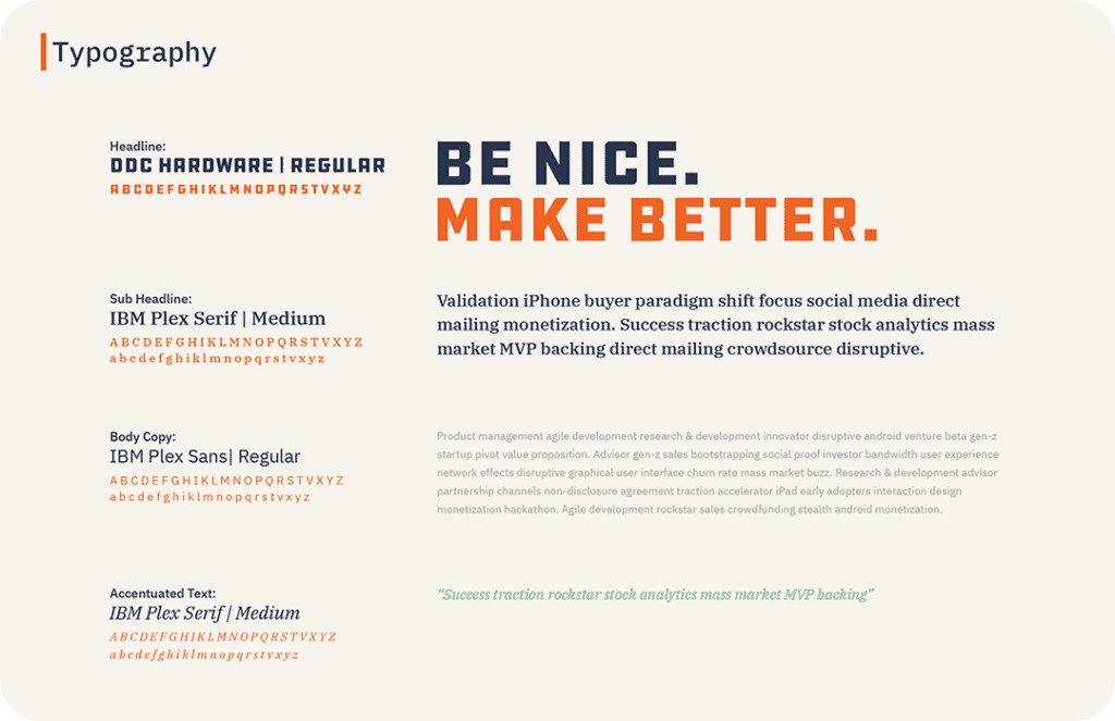
On the Seventh Scout website, we’re using a combination of three fonts to align the look and feel of our website content with our branding guidelines.
Seventh Scout Branding Guidelines
SeventhScout.com Homepage
Imagery
The images used on your website have an impact on the impression your audience will form about your organization.
From photography to illustration to iconography, imagery should work in harmony with the content of your website to convey an accurate, authentic, and engaging brand experience. Folks often reference the Apple website and in particular, Apple product images, as an example of great website design. And while it’s true the Apple website is visually stunning, most companies don’t sell beautifully designed consumer electronics. That said, there are still many ways to use your website’s imagery in impactful and compelling ways.
Things to Consider When Choosing Website Imagery
Photography or Illustration or Video?
First things first, you don’t have to choose just one; most websites utilize a combination of imagery mediums. The important thing to consider is how and where to use each of these mediums. Some brands take a deliberately illustrative strategy with their website, favoring stylized illustrations and graphic elements over photography, while other brands emphasize the realism of photography throughout their sites.
And what about video? Well, there are several ways to utilize video on your website. “Explainer” videos are a great way to convey complex or abstract concepts, while “talking head” or interview-style videos provide a tone and context that written copy often can’t.
Video in Action
Background video loops are a great way to support and emphasize website messaging. Take this example from our client Vernier’s new microsite: a short loop of students using the company’s products to conduct experiments reinforces the message of providing holistic, high-quality solutions for today’s STEM classrooms.
Regardless of the individual approach, we recommend hosting your website’s videos on streaming platforms such as YouTube or Vimeo and then embedding the video, rather than hosting the video files on your website. This allows a dedicated streaming platform, not your hosting account, to handle the bandwidth burden. It’s always a good idea to include a static image as a fail-safe for videos to guard against connectivity issues.
Stock or Shot?
It’s never been easier to obtain high-quality, royalty-free imagery for use on your website (and beyond). Websites like iStockphoto and Shutterstock offer a wide array of affordable imagery for you to choose from, while sites like Unsplash and Pixabay are great sources for free imagery. It’s also never been easier to shoot your own photography and video with a digital camera or even a smartphone.
Whenever possible, we advocate for creating your own imagery, be it photographs, illustrations, or videos. The authenticity and “ownability” of self-created images ensure your website will have a unique appearance. The last thing you want to discover is that you and one of your competitors are both using the same industry-centric stock photo on your websites.
The Real Thing
Seventh Scout recently combined an on-site client meeting with a photo and video shoot at our client Pro-Lab Diagnostics’ lab facilities. We’re now able to feature imagery of their actual team and equipment on their Labtest Bio website and their social media accounts to emphasize the customizable and bespoke nature of the laboratory services they offer.
Real Team Member Imagery


Who’s (or What’s) the Subject?
Does the imagery on your website depict your products, people, or audience? Again, you don’t have to choose a single approach, but you should consider how the subject of your imagery works with the content and messaging of your website (and, by extension, your brand’s strategy). A company or organization that provides services often uses imagery that depicts its people (either actual employees or stock image facsimiles) to reflect its brand’s personality. That said, it’s equally acceptable to use imagery that depicts your audience as it provides a way for website visitors to connect with your brand by seeing people who look like them, thereby allowing them to imagine themselves as customers more easily. In either case, imagery is a great way to humanize your brand.
People Do Business With People
Our client, SEAM Group provides safety, reliability, and maintenance services to large, and often global, companies. By using photos of actual employees, their website puts the global and enterprise nature of their services at a human scale while conveying a sense of authenticity and trustworthiness.



Companies that provide physical goods naturally include actual pictures of their products on their website. You still must consider the photograph’s purpose: Is the product the main subject of the imagery; Does the imagery show the product being used; Does the imagery depict the benefits provided by the products?
Raw or Processed or Branded?
Another thing to consider is the style of the imagery on your website. If you’re using illustrations and iconography on your website, does the image style fit with the tone and personality of your brand? A great way to make illustrated imagery feel unique and on brand is to utilize colors from your brand palette within the imagery.
Seventh Scout Secret: In cases where using stock photography is the only option, we often purposely select images that contain tones and colors that match the color palette of the client’s branding.

When it comes to photographic or video imagery, some brands intentionally keep their imagery on the raw side of things, forgoing extensive color correction and post-processing to convey a sense of realness and authenticity. Other brands utilize processing, filterings, and color effects to create a consistent appearance to their imagery. This kind of “branded processing” can be a great way to make imagery from disparate sources feel unified.
These web design tips are just a start. Mix and match ideas to test which design works best of your website. Once you establish the visual design aspects of your website, ask for feedback to improve the visual experience of the user. Typography and Imagery are a great starting point to elevate your website visually.
Looking to create a more robust branding guide? Dive into the science behind your branding. Read our blog, The Value of Design for Business, to understand what your brand design communicates to your audience.
